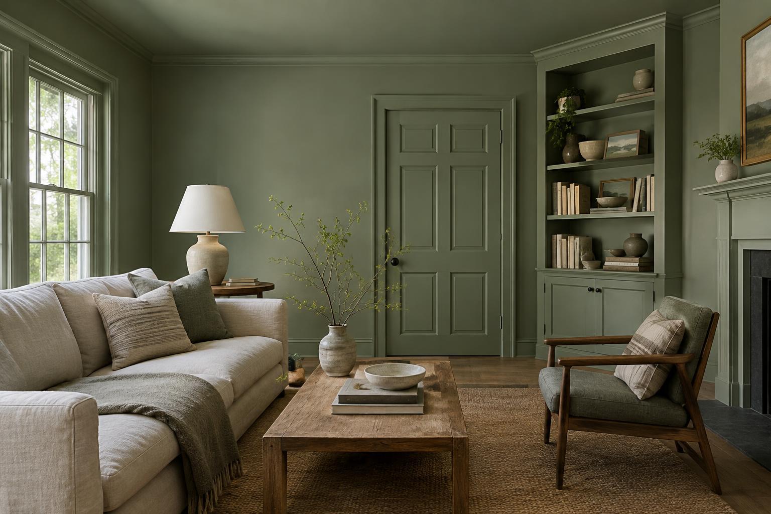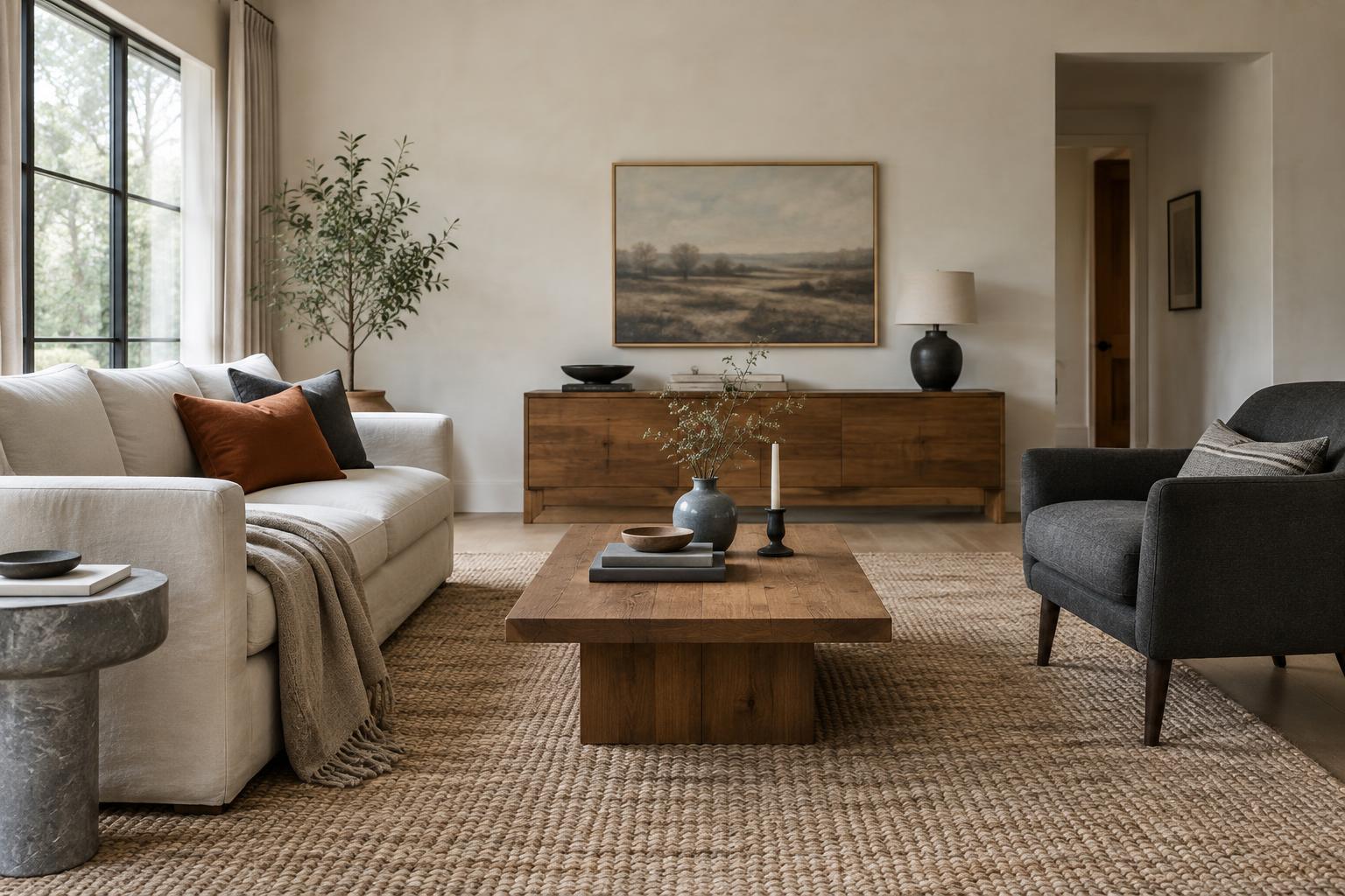
Start with the piece that is hardest to change
A patterned room does not need to begin with a complete scheme. Begin with the rug, curtains, or cushion fabric you already own and want to keep. If you are starting from scratch, the rug is often a useful first choice: it covers a large area and can establish the room’s main colors. Curtains can play the same role when they span a wide window or are the first thing you notice on entering.
Look closely at your starting piece and name its colors in ordinary terms: warm cream, deep blue, rusty red. Choose one or two of those colors to repeat elsewhere. The match need not be exact. A pale blue cushion can connect to a darker blue detail in a rug, while a cream curtain can pick up the rug’s background. Repetition makes different designs feel related without requiring a matching set.
Before adding anything, notice what is already busy. Bookshelves, artwork, wood grain, and visible storage all contribute visual detail. A room with many such elements may feel better with fewer patterned textiles than a room with plain walls and simple furniture.
Give each pattern a different scale
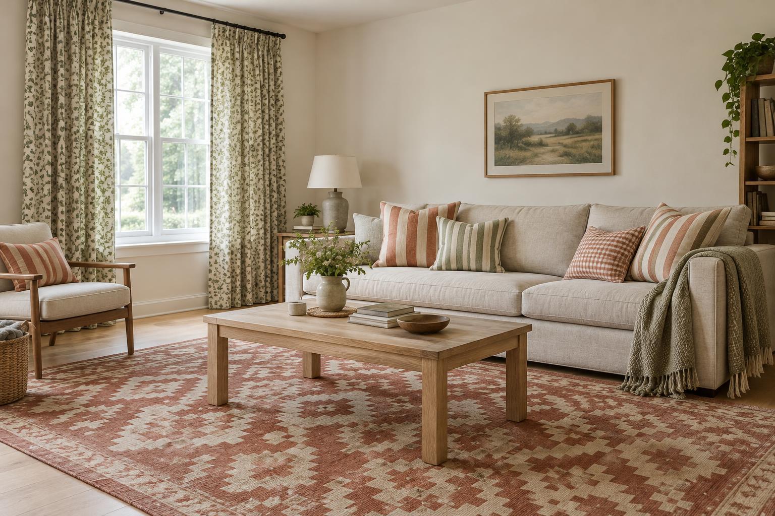
Patterns are easier to combine when they are not all competing at the same size. Try pairing a large, open design with a medium pattern and a small, close-together one. For example, a rug with broad shapes might sit comfortably with narrow striped curtains and a cushion covered in tiny checks. The designs differ, but their shared colors hold them together.
Scale is about how the pattern reads from across the room, not just the size of an individual motif. Two fabrics may both have small flowers, yet one appears almost solid from a distance while the other remains lively. Step back or look at samples from the doorway to judge their effect. If every piece seems equally prominent, replace one pattern with a subtler design or a plain fabric.
Mixing pattern types can help too. A geometric rug, a loose botanical curtain, and a simple striped cushion are less likely to look like imperfect copies of one another. You do not need three pattern types, though. Two well-chosen designs and a solid cushion can make a finished room.
Let the rug, curtains, and cushions play distinct roles
Think of these textiles as an anchor, a backdrop, and an accent rather than three equal statements. A bold rug can be the anchor. In that case, choose curtains that repeat one of its quieter colors and keep their pattern low-contrast or widely spaced. Cushions can then bring back a brighter rug color in a smaller dose.
If patterned curtains are the feature, the balance can shift. A rug with a restrained design or softly varied texture gives the eye somewhere to rest. Cushions offer an easy place to echo the curtain colors without duplicating the print. If both the rug and curtains are bold, plain cushions may be the most useful addition.
Consider how much of each textile you actually see. A curtain pattern may be prominent when drawn but barely noticeable when stacked beside a window. Cushions can disappear against a similar-colored sofa. Judge the combination in the room and in the positions you use every day, rather than relying only on small fabric swatches.
Use quiet space and texture to keep the mix comfortable
Plain surfaces are part of a patterned scheme, not a failure to finish it. A solid sofa, uncluttered wall, or simple throw creates space between designs. If a combination feels restless, you may not need to replace everything. Try removing one patterned cushion, turning a reversible one to its plain side, or choosing curtains closer in color to the wall.
Texture can add interest without introducing another obvious motif. A woven cushion, a nubby throw, or a rug with subtle variations in its pile may provide enough contrast beside a printed curtain. Pay attention to practicality as well as appearance: a pale rug in a high-traffic area or delicate curtains beside a frequently opened door may demand more care than you want to give them.
Contrast affects the overall mood. Patterns with strong light-and-dark differences tend to command attention; patterns with similar-toned colors usually feel calmer. Neither is inherently better. Decide where you want the eye to land, then let the other textiles support that spot.
Test the combination before committing
When possible, gather samples and view them together in the room at different times of day. Put a rug sample near the floor, hold curtain fabric beside the window, and place a cushion cover against the sofa. Light and neighboring furniture can change how a color appears. Photographs can help you compare options, but check the materials in person if you can.
For a simple trial, arrange your choices in order of visual strength. Is there one clear lead, with the other pieces supporting it? Do at least one or two colors recur? Does each pattern look distinct at a distance? These questions are more useful than a rigid rule about how many prints a room may contain.
Add pieces gradually if you are unsure. Cushion covers are often easier to switch than a rug or curtains, making them a good place to experiment. The aim is not a perfectly coordinated display: it is a room that feels connected, suits the way you use it, and remains pleasant to look at on an ordinary day.