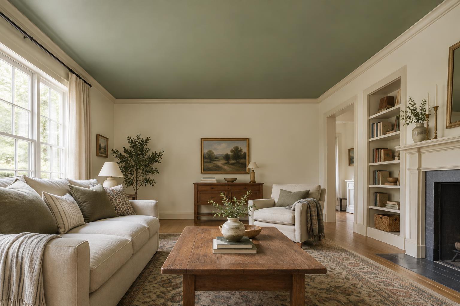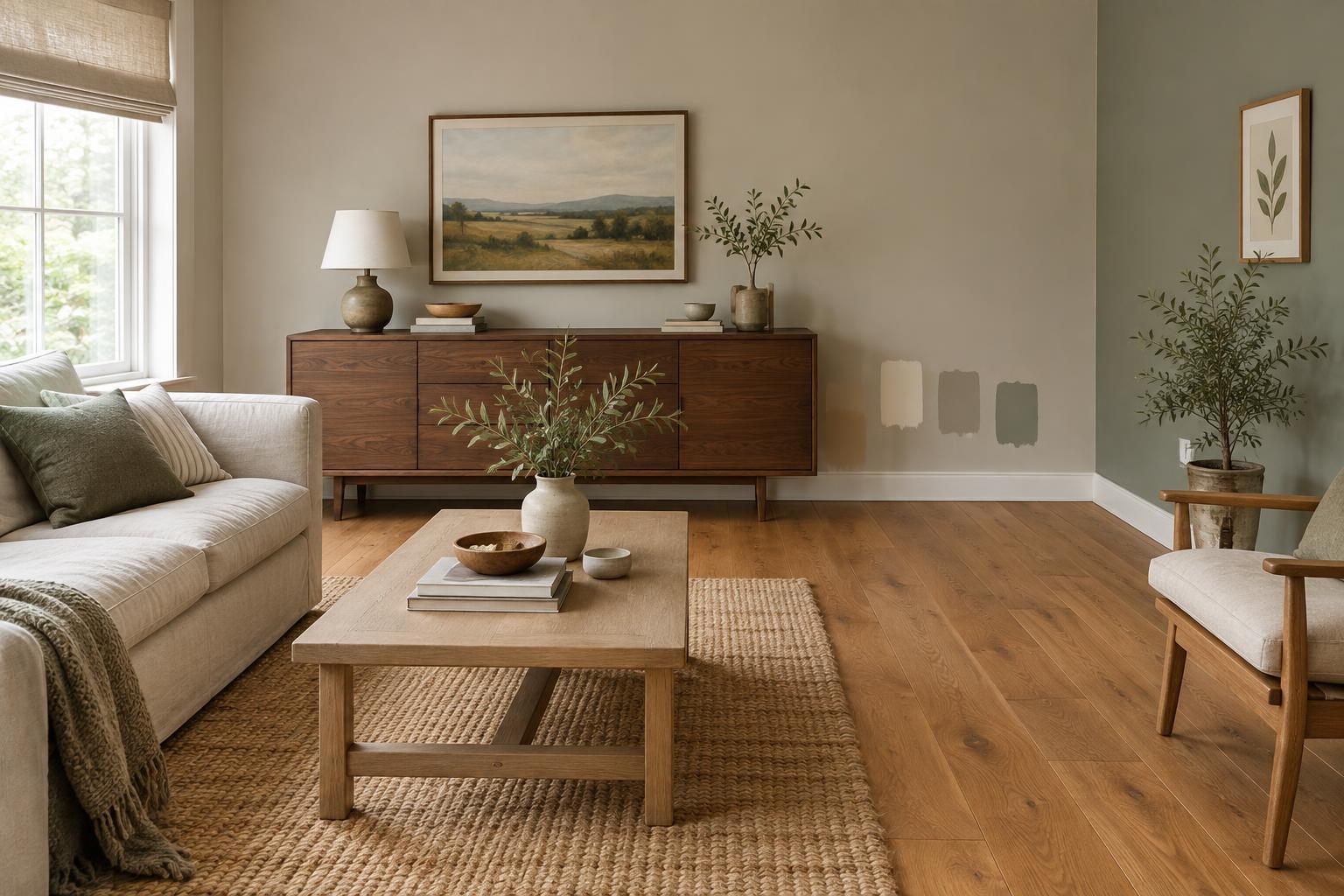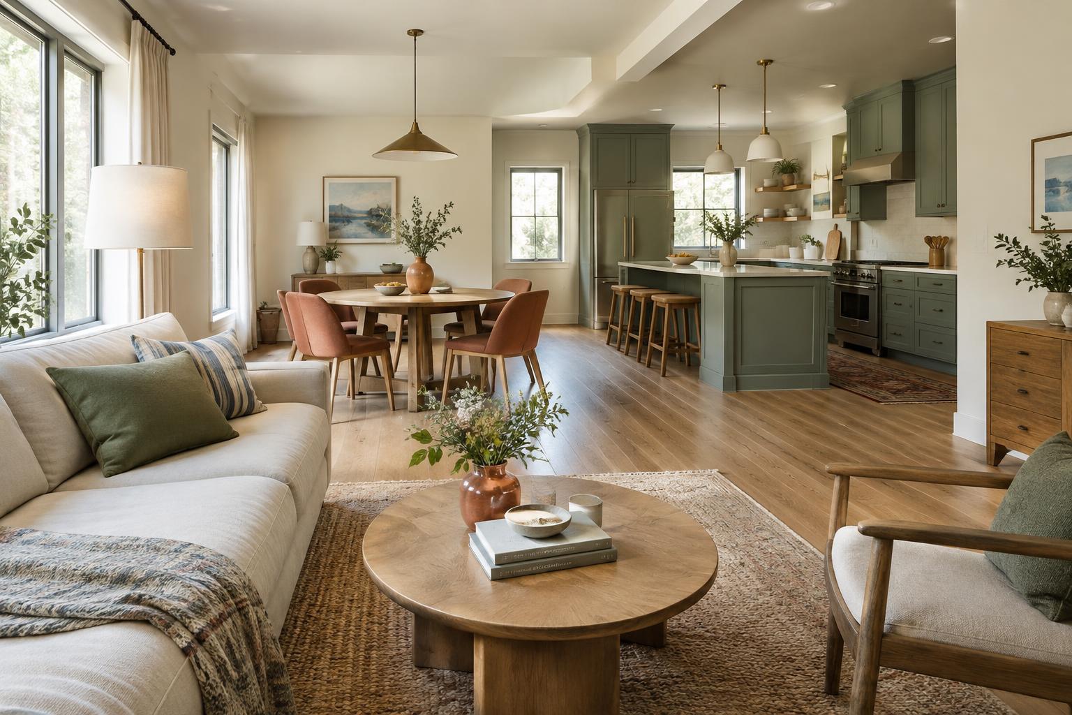
Start with the effect you want
Trim and doors take up less wall space than paint, but they can strongly influence how a room feels. A door painted like the wall tends to recede. A contrasting frame makes an opening more noticeable. A consistent neutral can connect rooms that have different wall colors. Before comparing paint chips, decide which of those jobs you want the woodwork to do.
Look at the whole room rather than an isolated section of baseboard. Notice the floor color, window frames, built-ins, and the view through each doorway. If the room already has a patterned rug, colorful furniture, or several finishes, quiet trim may provide balance. In a simple room, a stronger door or trim color can add definition without requiring more objects.
Match for a calm, continuous look
Painting walls and trim the same color reduces the number of visible edges. It can be especially useful when a room has many doors, low or uneven ceilings, or trim you do not want to emphasize. Matching does not require every surface to have the same sheen: some people use a more washable finish on doors and trim while keeping the color consistent. Because sheen affects how light reflects, the surfaces may still look slightly different.
You can match the door as well for a nearly uninterrupted wall, or keep doors distinct so they are easier to locate visually. If you choose the all-one-color approach, pay attention to handles and hinges; they will become more noticeable. Test the color on both a broad wall area and a trim-length sample. A shade that looks gentle on a small chip may feel more intense when it covers an entire room.
Contrast when the details deserve attention
Contrasting trim outlines windows, doorways, and baseboards. Light trim against darker walls gives clear definition; dark trim against lighter walls can make ordinary openings feel more deliberate. This approach works best when the lines being highlighted are reasonably consistent. If one wall has several mismatched door frames or awkward repairs, contrast may draw attention to those details too.
A contrasting door can also be a smaller commitment than contrasting every piece of trim. Try one color on an interior door while leaving its frame aligned with the rest of the house. For a connected look, repeat the door color in another modest place, such as a cabinet, chair, or textile. The repetition does not need to be exact, but it helps the door feel like part of the room rather than a separate statement.
Use a neutral to link different rooms
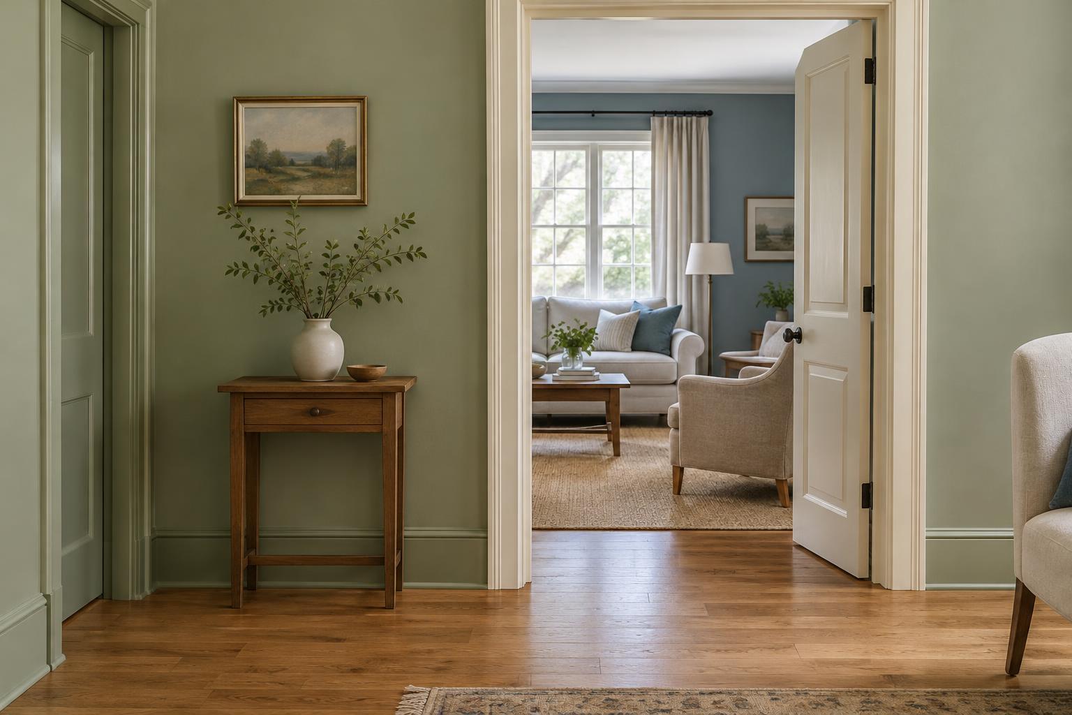
When adjacent rooms have different wall colors, a shared trim color can act as a visual thread. White is one option, but warm off-white, soft gray, muted beige, and deep charcoal can also serve as neutrals. The useful question is not whether a color is technically neutral; it is whether it sits comfortably beside the wall colors and fixed finishes in your home.
Pay particular attention to undertones. A crisp, cool white may look stark beside creamy walls or warm wood floors, while a yellow-leaning white may seem dull next to a cool blue wall. Place candidate samples beside the floor, countertop, tile, or other finishes that will remain. If those materials vary widely across rooms, choose a neutral that looks acceptable with all of them rather than perfect in only one.
Doors do not always have to follow the trim. Keeping trim consistent while painting doors in room-specific colors can add personality, though the view down a hallway may become busy. If you prefer a quieter transition, carry one door color through the connected spaces.
Test the choice where you will live with it
Paint can change appearance from morning to evening and under different bulbs. Make movable sample boards if possible, then hold them vertically near a doorway, a window, and a baseboard. Check them alongside both rooms when a door connects two spaces. Give yourself time to see the samples in daylight and with the lights you normally use.
Before buying paint, decide where each color will stop. A door’s edges can be visible from different rooms depending on whether it is open or closed, so include them in your plan. Also check the condition of the surfaces: a smooth, clean finish often matters as much as the color itself. Matching, contrasting, and going neutral can all work. The strongest choice is the one that gives the right amount of emphasis to the details you see every day.