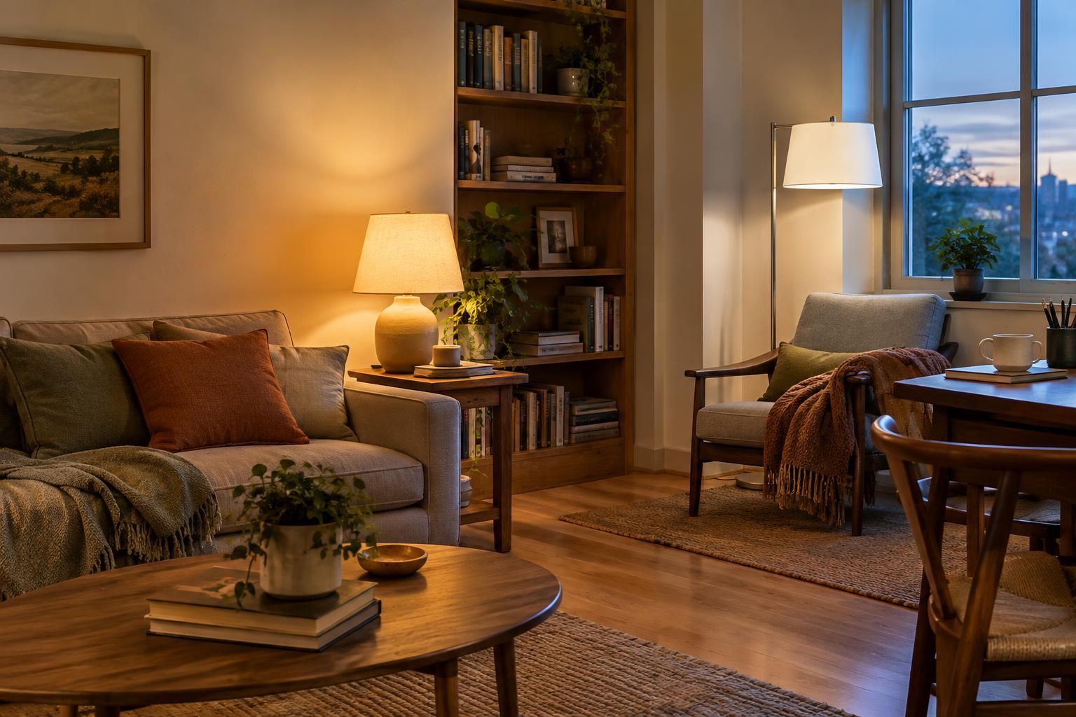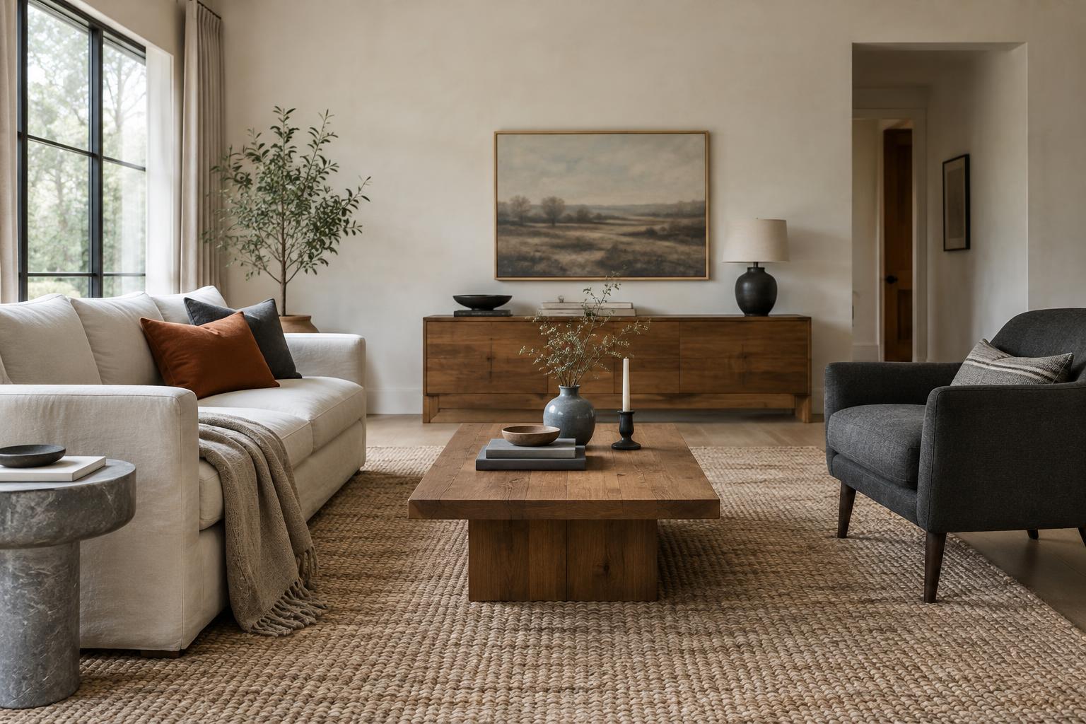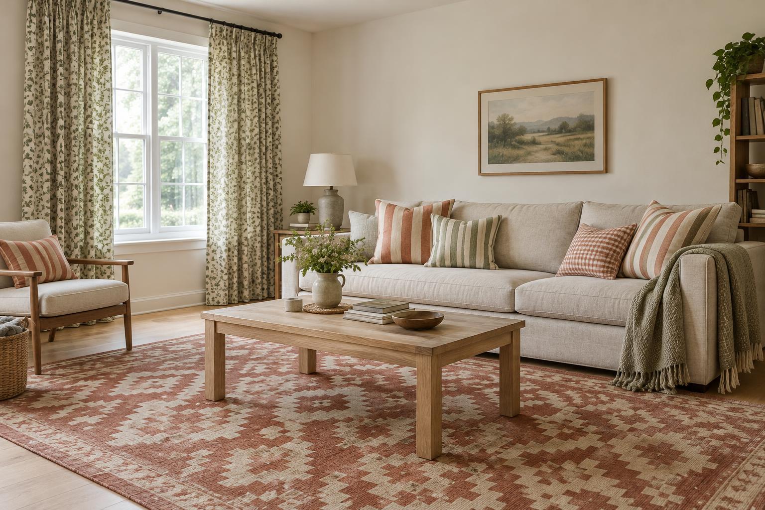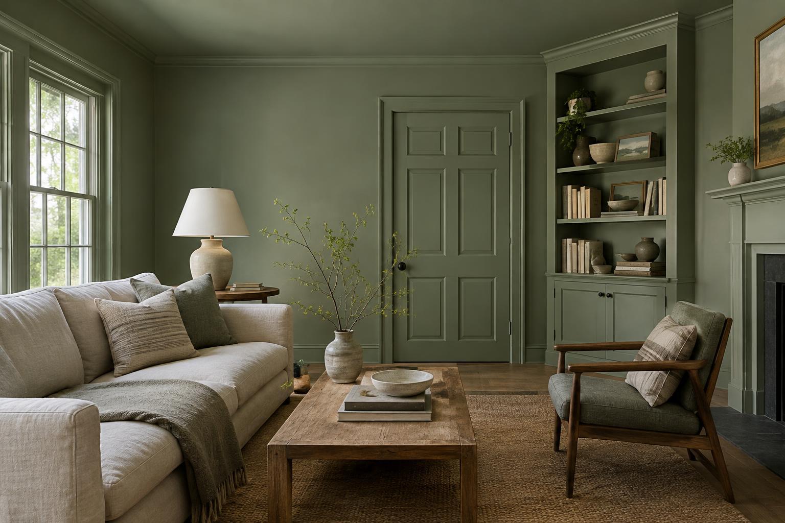
What color drenching actually means
Color drenching is the practice of carrying one color across multiple surfaces in a room. Instead of painting only the walls and leaving the ceiling and trim white, you might paint the walls, skirting boards, doors, and ceiling in the same shade. The aim is to make those surfaces read as a connected whole rather than as separate bands and outlines.
It does not require every object to match. Flooring, furniture, textiles, and artwork can all bring contrast. Nor does every painted surface need the same finish: a wall and a door can share a color while using finishes suited to their different levels of wear. If a fully matched room feels too much, you can start with the walls and trim, then decide whether to include the ceiling.
Where the approach works well
Color drenching can be useful in rooms with many visual interruptions, such as several doors, awkward corners, or prominent trim. Giving those details the same color as the walls can quiet the outlines and help the room feel more unified. An entryway or hallway can also be a manageable place to try it: the color makes an impression, but you do not spend hours in the space at once.
In a bedroom, a soft, muted shade can create a settled backdrop for bedding and lamps. A deeper color can feel enveloping in a reading room or dining area, particularly if you want a distinct mood there. Small rooms are not automatically off-limits. Painting the ceiling the same color as the walls may reduce the sharp boundary between them, though the overall effect will still depend on the light, furnishings, and shade you choose.
There are times when restraint makes more sense. If you enjoy a bright white ceiling, need one room to flow visually into another, or want architectural trim to stand out, a single-color treatment may work against your goal. Color drenching is an option for organizing a room visually, not a rule that every surface has to follow.
Choose the shade in the room, not just on a card
A color covers much more of your view when it moves from a small sample to four walls and a ceiling. Begin with the atmosphere you want: gentle and airy, warm and grounded, or rich and dramatic. Then look at fixed elements you are not changing, such as flooring, countertops, tile, and large furniture. A paint color does not have to match them, but it should sit comfortably beside them.
Test a few likely shades on large sample boards or in clearly separated patches. Look at them on more than one wall and at different times you normally use the room. Daylight, lamps, and shadows can make the same paint appear different across surfaces. Check the ceiling too; it receives light differently from a vertical wall. If you are unsure, living with samples for a few days is more useful than deciding under store lighting.
Plan the edges and finishes before painting
Decide which surfaces belong in the color plan before you buy paint. Will built-in shelving, window frames, radiators, and the inside of the door join the walls? There is no universal answer, but a clear stopping point matters. A doorway can provide a natural boundary between rooms; an isolated white strip of trim may look accidental if everything around it is drenched.
Choose finishes with the surface in mind and confirm that the products you select are appropriate for each use. Walls may benefit from a finish you can clean, while doors and trim usually need to withstand frequent contact. Matching the color across different finishes can introduce a slight difference in appearance, especially where light hits at an angle. Test them together if an exact-looking match is important to you.
Preparation still counts. Repair visible marks, clean surfaces, and follow the paint maker’s guidance on priming and application. A single color can simplify decisions, but it also draws attention to uneven coverage where adjacent surfaces meet.
Let the rest of the room provide balance
Once the painted surfaces are continuous, give the eye a few places to rest. Wood, woven materials, ceramics, metal, or a rug can add texture without competing with the room’s main color. You might repeat a related tone in a cushion or artwork, then introduce a contrasting accent through a lamp or chair. This creates variety while keeping the space coherent.
Before committing, consider how much of the chosen color you want to live with each day. A shade you love on a feature wall may feel different overhead and around every corner. Starting in one room, testing generously, and making a deliberate plan for each surface will give you a better basis for deciding whether to go all in.