Choosing a color before looking at the room
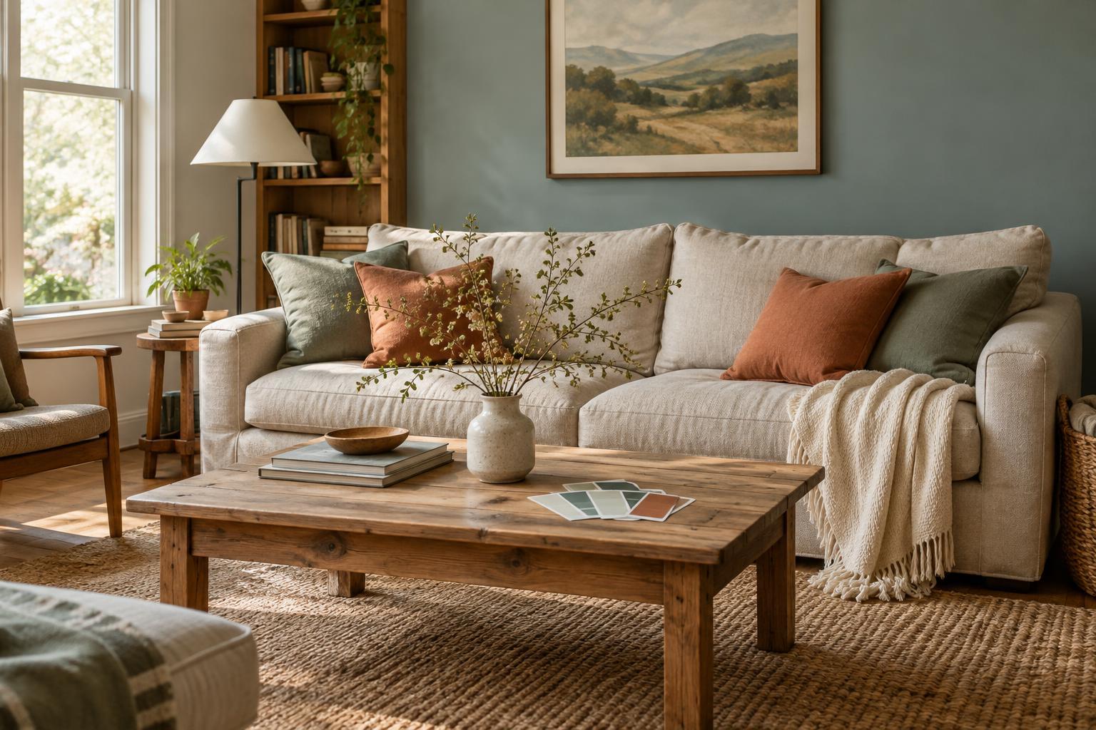
A paint color does not appear in isolation. Daylight, lamps, flooring and nearby furniture all affect how it looks. A soft beige that feels warm in a shop may appear dull beside a gray sofa or surprisingly yellow under a warm bulb. The mistake is not choosing beige; it is deciding from a small sample without seeing it in the room where it will live.
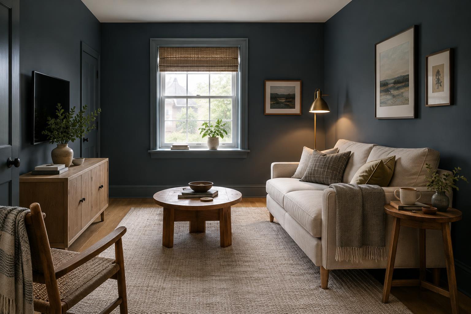
Before buying paint for the whole space, put generous samples on more than one wall or paint them onto movable boards. Look at them in the morning, after dark and with the lights you normally use. Place a board near the floor and beside the largest pieces of furniture. If a color works only at one time of day, decide whether that is the time you most use the room. This test is slower than picking from a card, but much quicker than repainting.
Ignoring undertones in colors you already own
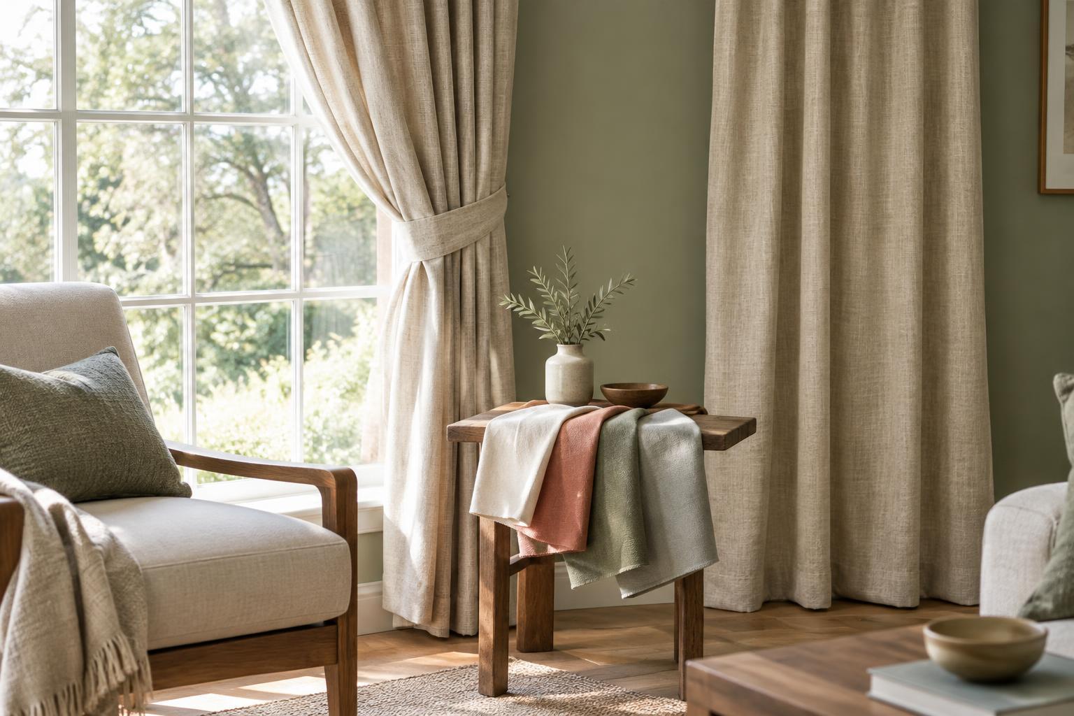
Two colors can both be described as white, gray or brown and still sit uneasily together. One may lean pink while the other leans green; one may feel cool beside a warmer floor. These differences often become most obvious where surfaces meet, such as a wall against trim, a rug against wood flooring or curtains beside a painted window frame.
Start with the elements that are hardest to change. Lay possible paint or fabric samples next to the flooring, countertop or main sofa, rather than comparing samples only with one another. If a wall color clashes with a fixed surface, you do not necessarily need to replace either one. A rug, curtain or piece of art that contains colors from both can make the transition feel more intentional. When the clash is sharpest at an edge, changing the trim color may help more than adding another accent.
Making every surface compete
A favorite bright color can lose its charm when it appears on the walls, rug, curtains and accessories at the same intensity. The opposite problem is possible too: a room made entirely of similar midtones can feel flat because nothing has a clear role. In both cases, the issue is less about the individual colors than how much space each one occupies.
Give the room a loose hierarchy. Let one color form the background, use a second on substantial pieces such as upholstery or curtains, and save the strongest accent for smaller areas. This is a guide, not a rule requiring precise percentages. If the room feels busy, remove a few competing accents before buying anything new. If it feels flat, try one darker or lighter element—a lamp, cushion, frame or side table—before committing to a bold wall.
Using the same white everywhere without checking contrast
White is often treated as a safe default, but it still has a color character. A cool white wall can make creamy cabinets look yellow, while a very warm white may seem muddy beside crisp tile. Matching every surface exactly can create another problem: trim, doors and walls may blur together when you hoped for a little definition.
Decide what you want the white to do. For a quiet, continuous look, keep walls and trim close in tone, then vary the finish or add texture through fabric and wood. For clearer edges, test a deliberate difference between wall and trim colors. Compare samples directly against existing white surfaces, especially those you cannot easily change. You can also soften an awkward contrast with a runner, shade or artwork that repeats both tones; a small adjustment may be enough.
Forgetting the view into the next room
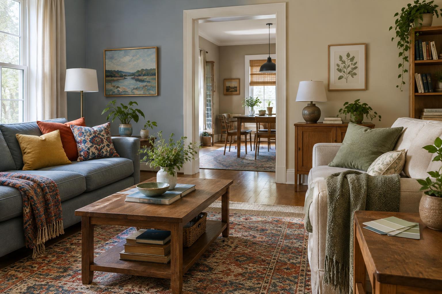
A color can work beautifully inside one room yet look abrupt from the hallway. This matters most where doors stay open or where several rooms are visible at once. You do not need to paint the whole home in one palette, but it helps to consider what the eye sees from common standing and sitting positions.
Stand at each doorway and notice which surfaces are visible together. If adjoining rooms feel disconnected, repeat a color in a different form: a blue wall in one room might relate to blue ceramics or a patterned cushion in the next. Similar wood tones or a consistent trim color can also provide continuity. Take this wider view before making a final choice, then let each room have enough variation to suit how you use it.