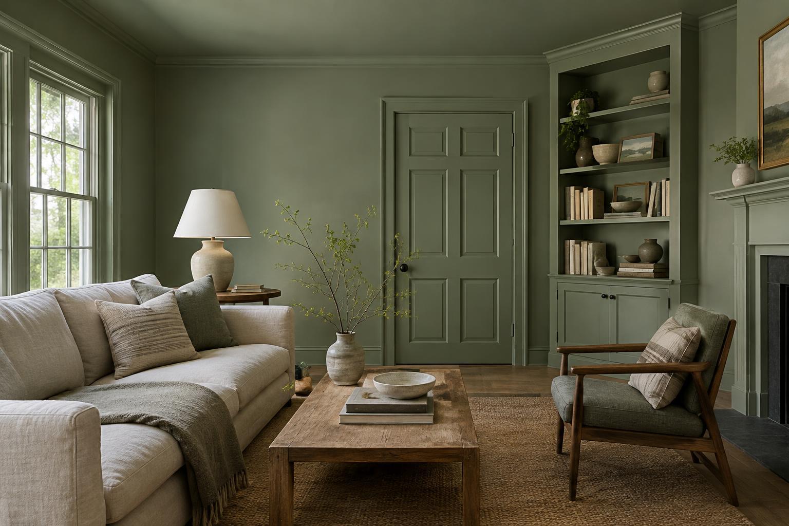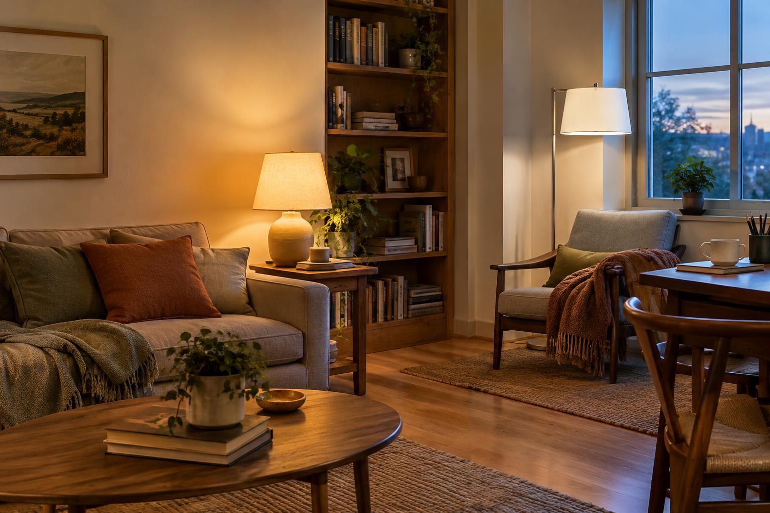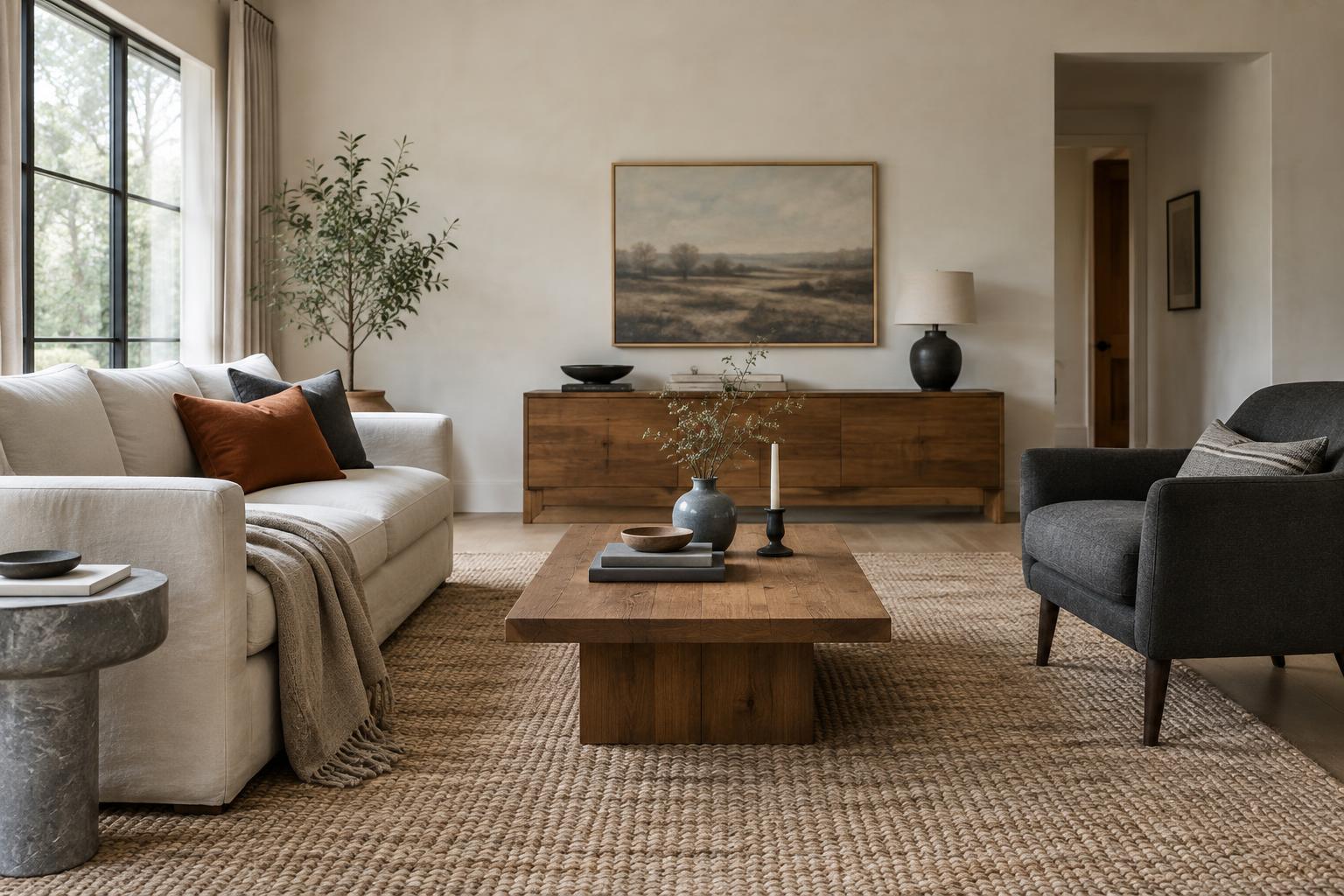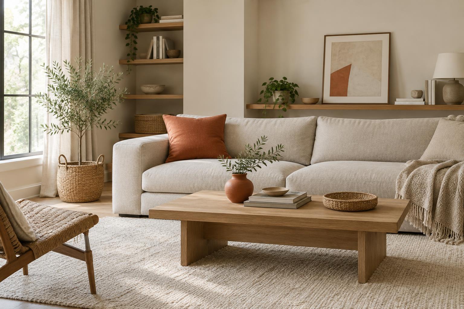
Start with what the room already has
Before bringing in a new color, look at the surfaces that take up the most space: walls, flooring, a sofa, large cabinets, and window coverings. These form the room’s visual base, whether or not you chose them. Notice their undertones as well as their obvious colors. A warm wood floor, for example, may make a sharp, cool accent feel more prominent than you expected. You do not need to match everything, but knowing what is already there helps you choose a color that feels deliberate.
Next, decide what you want the accent to do. A muted green might soften a room full of hard edges; a clear red might bring energy to a mostly neutral space. Give one color the leading role before adding others. If the room already contains several strong colors in artwork or upholstery, you may have enough to work with. Pulling one of those colors into a smaller object can make the space feel connected without introducing another competing note.
Repeat the color, but not everywhere
An accent often feels more settled when it appears in more than one place. That does not mean buying a matching set. Try a cushion on the sofa, a little of the same color in a picture across the room, and a bowl on a shelf. The repetition gives the eye a path through the space. Because the objects serve different purposes and sit at different heights, the result can feel more natural than a row of identical accessories.
Leave gaps between those touches of color. If every shelf, tabletop, and chair carries the accent, it may stop feeling like an accent at all. You can also repeat a color in slightly different tones rather than insisting on an exact match. A deep blue throw and a softer blue print can belong together, especially when the surrounding materials provide a consistent backdrop. Step back and check whether your eye can still rest on quieter areas of the room.
Use size and contrast to control the effect
A color’s impact depends on where and how much of it you use. A bright yellow armchair will command more attention than a yellow book spine or vase. If you are unsure about a vivid shade, begin with a small, movable item. You can enjoy the color without committing a large part of the room to it. Conversely, a softer accent can often cover more area: curtains or a rug in a muted tone may add warmth while remaining easy on the eye.
Contrast matters too. A pale accent against a pale wall reads differently from the same accent against charcoal. If the room feels busy, you may not need to remove the color; you might simply need to reduce the number of high-contrast spots. Let one or two areas draw attention, then allow nearby objects to be quieter. A useful question is: what should someone notice first when they enter? Arrange the strongest color accordingly.
Let texture and pattern do some of the work
Color does not have to arrive as a flat, solid block. A woven cushion, glazed ceramic piece, or patterned textile can introduce an accent alongside texture. These materials can make the color feel integrated with the furniture and objects you already use. A pattern is particularly handy when it contains both your accent and a color from the room’s base; it can act as a bridge between them.
Patterns still need breathing room. If you have a patterned rug and lively artwork, consider keeping nearby cushions simpler. If most surfaces are plain, one patterned object may add enough variety. Pay attention to texture in neutral pieces as well: wood grain, linen, and matte finishes contribute visual interest without adding more colors. That can help you resist the temptation to fill every quiet corner with another bright accessory.
Test the room before adding more
Live with a new accent for a little while before expanding it. Put a cushion in place, drape a fabric sample where curtains might hang, or move a colored object between rooms. Look at it in daylight and under the lamps you normally use. Color can appear different as the light changes, and a shade you love in a shop may feel stronger across a large wall at home.
Finally, edit for comfort rather than following a fixed formula. If the room feels crowded, try removing one accent object and see whether the remaining pieces stand out more clearly. If it feels unfinished, add color where there is a genuine gap, not simply where there is an empty surface. The goal is not perfect coordination. It is a room with enough personality to feel like yours and enough calm to make everyday use pleasant.