Choose an anchor you want to keep
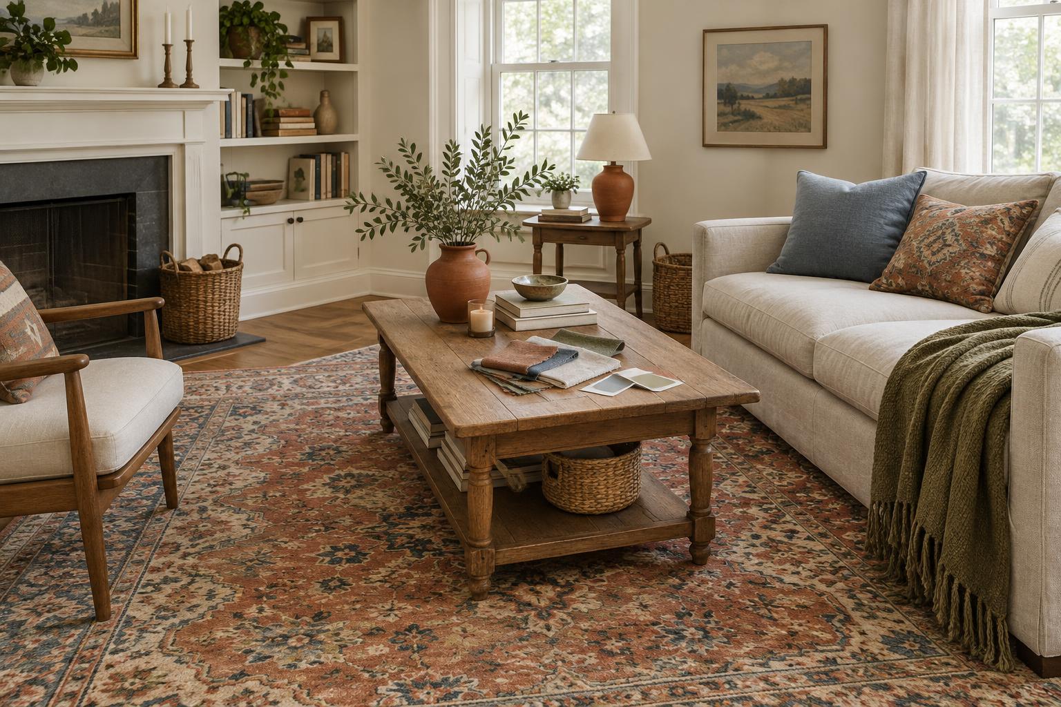
A room palette does not have to begin with a paint chart. It can start with the patterned rug you already like, a well-worn leather chair, a framed print, or the sofa that is staying put. Choose one piece that is large enough to influence the room or important enough that you want the rest of the space to support it. If several pieces are staying, begin with the one that is hardest to change, then check that your choices also work with the others.
Look at the anchor in the room where it lives, rather than relying on a product photo or a memory of its color. Notice its background color, its most obvious color, and any quieter tones that appear in smaller areas. A rug that first reads as blue, for example, might also contain warm cream and a little muted rust. Those less prominent colors may be easier to use elsewhere than the boldest blue.
Give each color a job
Pick a small working palette: a base color for broad surfaces, a supporting color for medium-sized items, and one accent for smaller details. You can also keep a neutral that connects the palette to things you will not change, such as flooring or cabinets. These are roles, not strict proportions. A strong color already present in a large sofa may need only a quiet echo in a cushion or piece of art.
You do not need to copy every shade in a patterned anchor. Select the colors that suit the room you want to use. For a calm space, take the softer tones from the piece and let its brighter color remain the focal point. For a livelier room, repeat a bolder hue in a few places separated around the space. Repetition makes a choice feel deliberate, but identical shades are not necessary; slight variations can give the room more depth.
Check the room before choosing paint
Before buying anything, list the finishes and colors that will remain: floorboards, tile, trim, countertops, large furniture, and window coverings. Their undertones matter. A creamy rug may feel comfortable beside a warm off-white wall, while a stark, cool white could make it look more yellow than you intended. The aim is not to make every surface match. It is to avoid combinations that distract from the piece you chose as your anchor.
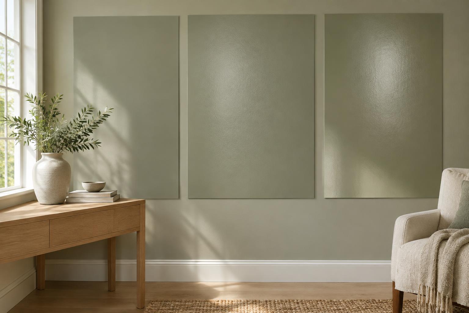
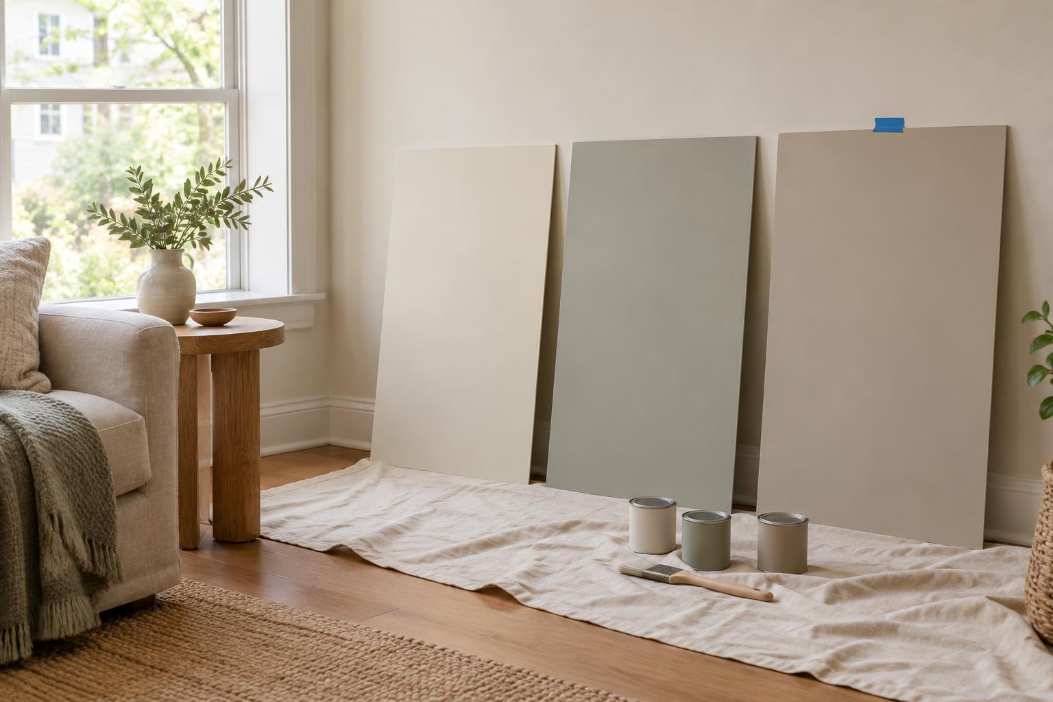
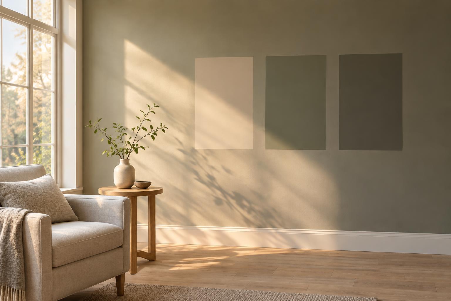
Then pay attention to light. A color can look different near a window, in a shaded corner, and under the lamps you use at night. Place movable samples or painted sample boards near the anchor and view them at different times you are normally in the room. If you are deciding between two close neutrals, look at them beside the flooring and trim as well. A small chip held on its own rarely tells you enough about how a wall-sized color will feel.
Build the palette through useful layers
You can introduce color without repainting. Curtains, bedding, lampshades, cushions, a throw, or a storage piece can carry one of your supporting colors. Choose items for their function first: curtains should give the privacy or light control you need, and a rug should be suitable for the wear the room receives. A beautiful color is less satisfying if the object makes everyday use harder.
Mixing materials also keeps a limited palette from feeling flat. A pale color might appear in smooth painted wood, textured linen, and a ceramic lamp, with each surface reflecting light differently. If the anchor has a busy pattern, allow some nearby items to be plain. If the anchor is a solid color, texture and a modest pattern can add interest without introducing several new hues.
Shop slowly and edit in place
Take a photo of the anchor in daylight and, when practical, carry a small fabric sample or paint swatch while shopping. Photos are useful reminders, but screens can shift colors, so compare physical samples at home before committing to an expensive item. For each potential purchase, ask whether it fills a real need, fits the palette, and works with what is already in the room. If it does only one of those things, keep looking.
Once a few elements are in place, step back and notice where your eye goes. If everything competes with the anchor, remove or quiet one accent rather than adding another color to fix it. If the room feels disconnected, repeat an existing tone once in a different area. A good palette is not a list of perfectly matched products; it is a manageable set of choices that lets the piece you love belong in the room.