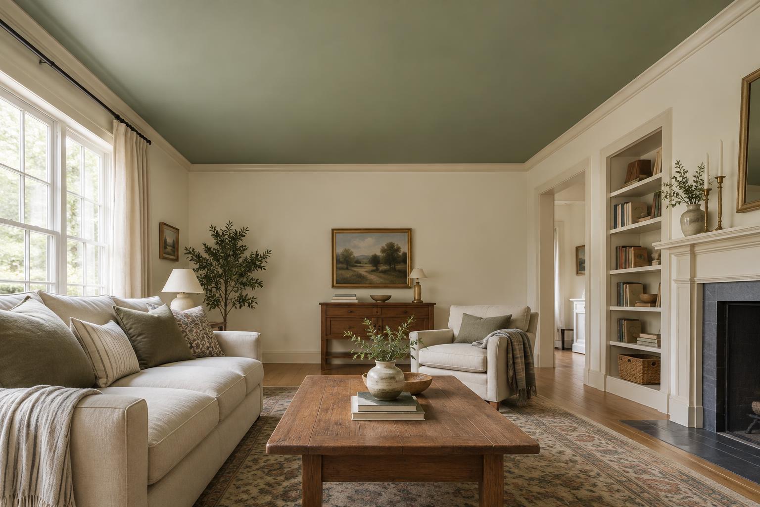
Start with the room, not the paint chart
A white that looks simple on a paint chip can feel creamy, gray or faintly pink once it covers a wall. That does not mean you chose badly: white is especially sensitive to its surroundings. Before collecting samples, look at the features that will stay in the room, such as flooring, tile, countertops, curtains and large pieces of furniture. The most useful white is one that works with those elements, not necessarily the one that looks brightest on its own.
Decide what you want the room to feel like. A crisp white may suit a space with clean-lined furniture and cool-toned finishes. A softer, warmer white can be comfortable alongside wood, woven textures and muted colors. If the room contains a mix of finishes, a less stark white may help them sit together. These are starting points rather than rules; the actual room will give you better information than a color name.
Look for the undertone
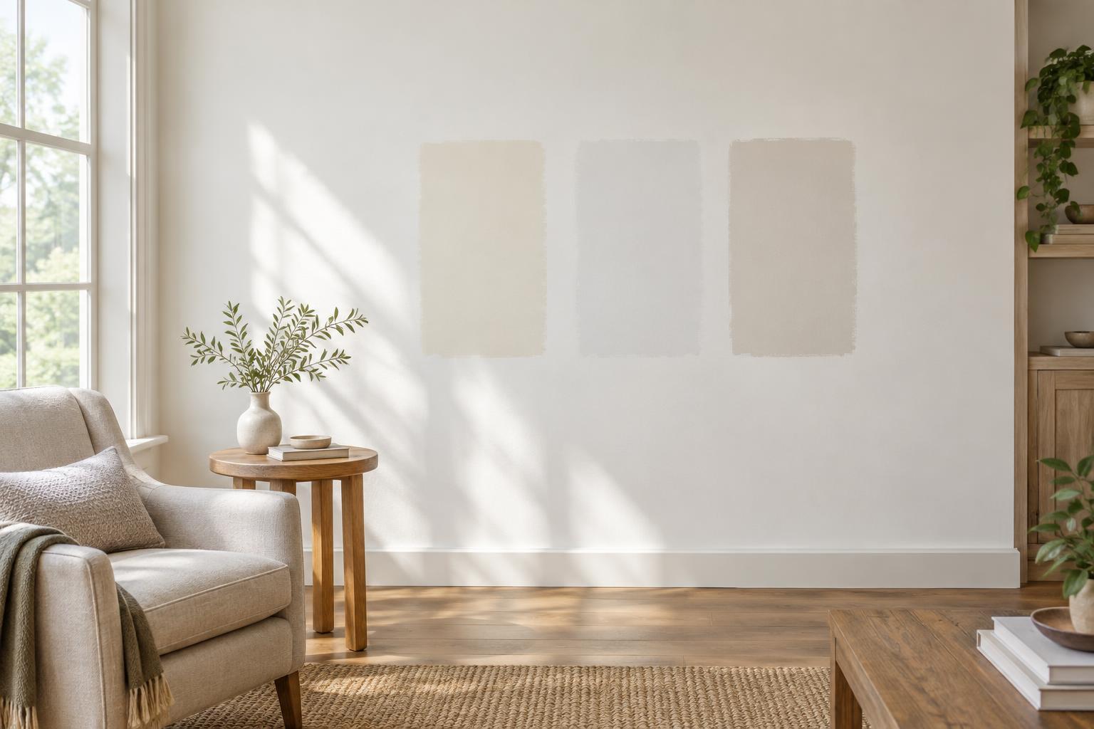
Most whites have an undertone that becomes easier to see when you compare them. Place several paint chips next to one another against a plain background. One may appear more yellow, another pink, gray, green or blue. You are not trying to find a white with no undertone at all. You are trying to find one whose undertone does not clash with the finishes you plan to keep.
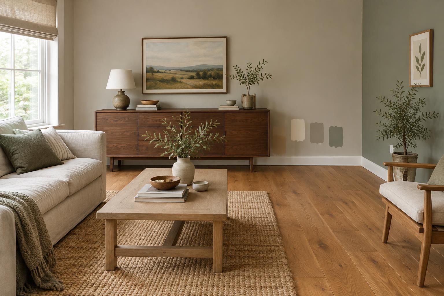
Compare your shortlist directly with those finishes. Hold the chips near the kitchen backsplash, beside a sofa or against the floor rather than judging them only under a shop light. Pay particular attention to any existing white surfaces. A painted wall beside a white cabinet or tile may make that fixed white look unexpectedly cool or dingy by comparison. If you are painting trim as well as walls, you can test the two colors together before committing to either.
Test samples where you will live with them
Narrow your choices to a manageable few, then buy samples. Paint generous areas on separate sample boards that you can move around the room, or apply samples to the walls in more than one location. Small swatches can be misleading because the surrounding wall color influences what you see. Follow the paint maker’s guidance on coats and drying time so you judge the finished color rather than the first wet layer.
Move the samples beside windows, into corners and near the finishes you identified earlier. Check them in morning light, later in the day and under the lamps you normally use. A white may seem lively by a window but flat in a dim corner; another may feel pleasant in daylight and too yellow at night. Notice which change you can happily live with. Every paint color shifts somewhat as the light changes, so the goal is not perfect consistency.
Choose a finish for the surface
Color is only part of the decision. Paint sheen affects how a white reads and how the surface handles everyday use. A flatter finish generally draws less attention to uneven walls, while a glossier one reflects more light and can make marks or surface flaws more noticeable. Finishes described as washable can be useful in busy spaces, but their appearance and cleaning performance vary by product. Check the specific paint’s label and, if possible, view a finish sample.
Think about walls, trim and ceilings as a group. Using the same white on all three can create a quiet, continuous look, even if you choose different appropriate finishes for each surface. Using different whites can also work, but test them side by side: two nearly matching whites may look accidental when one has a noticeably different undertone. If you prefer contrast, a clear difference is often easier to judge than a subtle one.
Make the final choice without chasing perfection
When you have lived with your samples for a few days, remove the ones that look wrong next to permanent finishes or feel unpleasant at a time when you regularly use the room. Then choose among the remaining options based on the atmosphere you want. It is reasonable to prefer a white that feels comfortable most of the day over one that looks spectacular for a single hour.
Before buying enough paint for the whole room, note the exact color, product line and finish you tested. Prepare the surface and use the recommended primer where needed, since what is underneath can affect the result. White paint is not a single perfect shade waiting to be found. It is a backdrop that should make the room’s light, materials and daily activities feel at ease.