Decide what you want the curtains to do
Before comparing colors, decide whether the curtains should recede, frame the window or become a feature. Curtains close to the wall color create a continuous look, especially when the fabric runs from near the ceiling to the floor. A contrasting color makes the window more prominent. Neither approach is inherently better; the choice depends on what else deserves attention in the room.
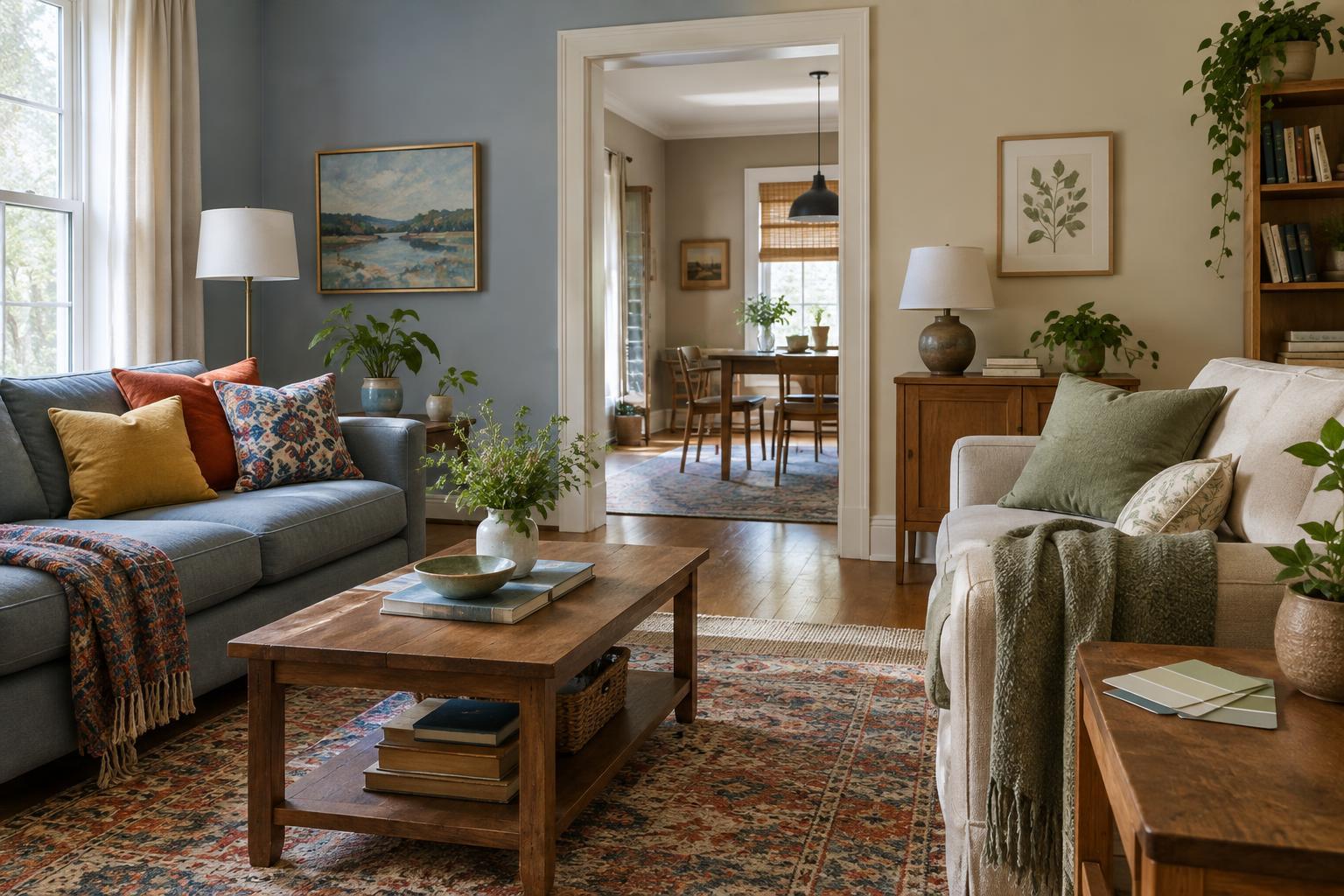
Look at the wall, floor and largest pieces of furniture together. If the room already has a patterned rug, colorful sofa or busy artwork, quiet curtains may give the eye a place to rest. In a simpler room, the curtains can supply color without requiring a change to the paint. The aim is not to match every object, but to make the window treatment feel connected to something else in the space.
Look beyond the wall color name
Two colors can both be called beige, gray or white and still look awkward together. One may lean yellow or pink while the other leans blue or green. Compare the undertone of the paint with the curtain fabric rather than relying on their labels. A warm cream wall often feels more settled beside an oatmeal or warm white fabric than beside a stark, cool white. A blue-gray wall may suit a cooler off-white or a muted blue.
A close match needs particular care. Fabric and paint reflect light differently, so curtains intended to be “the same color” may instead look like an accidental near miss. If you cannot find a convincing match, choose a visibly lighter or darker shade in a related color family. The difference will look deliberate.
Choose a level of contrast
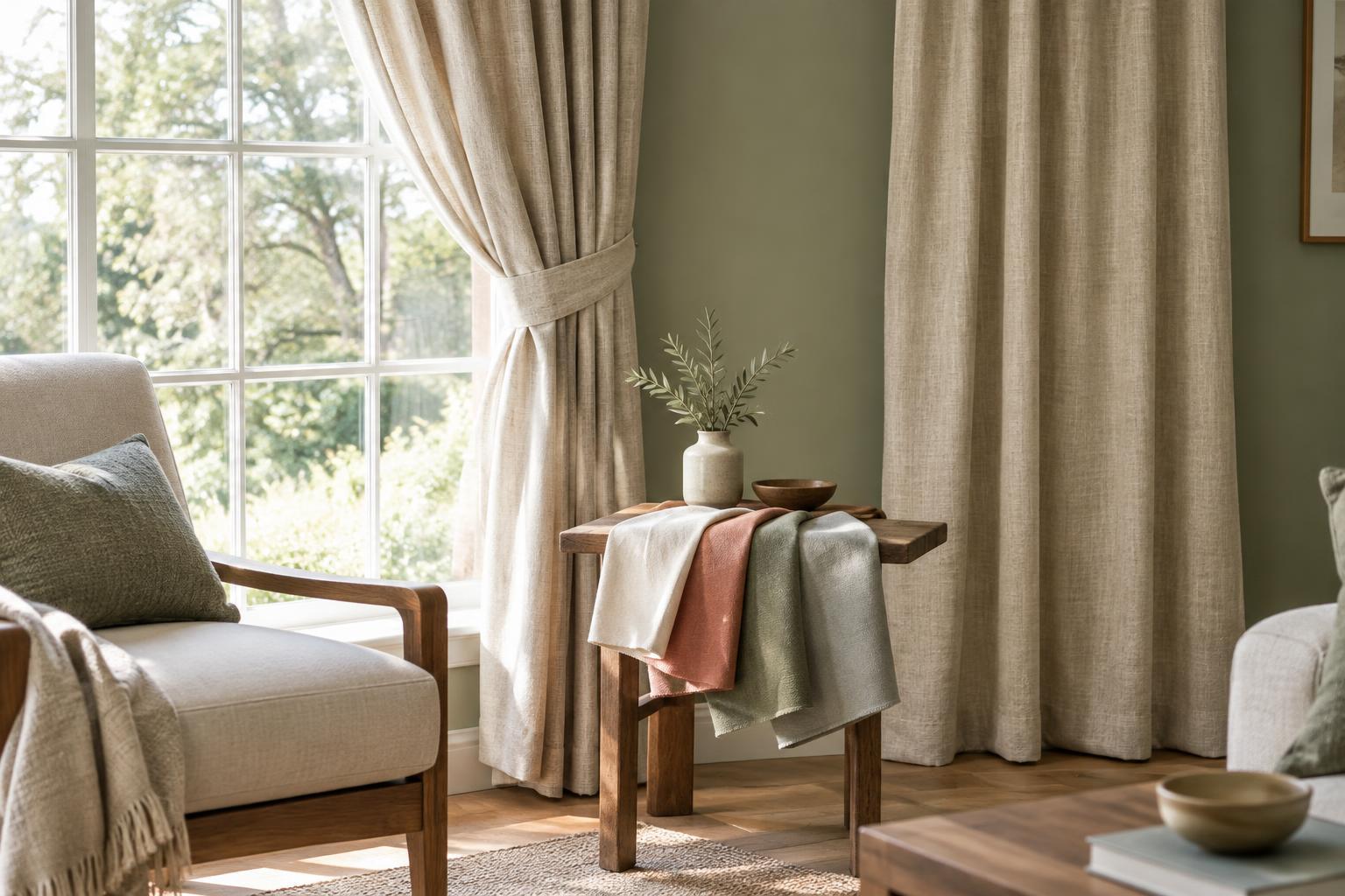
Low contrast is useful when you want a calm backdrop. Pair soft green walls with a paler, muted green, for example, or use curtains in a neutral that shares the paint’s warmth. This keeps the window present without making it the first thing you notice. Texture can add interest: a woven fabric may provide enough variation even when its color is close to the wall.
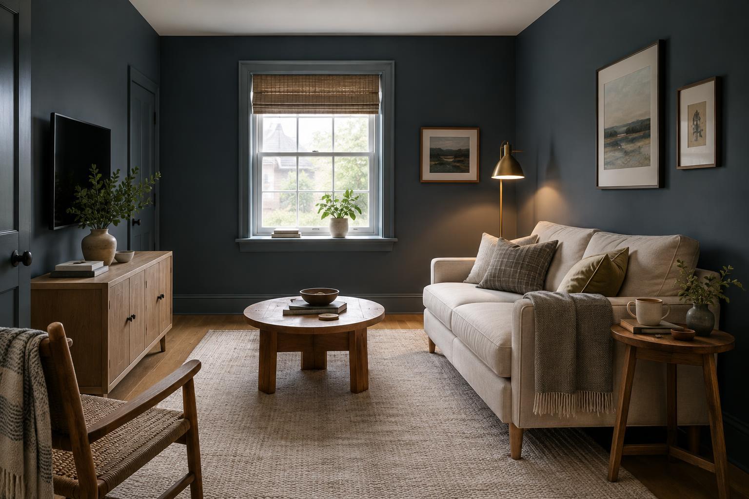
For more definition, try a light-versus-dark pairing. Deep curtains can give pale walls a clear edge, while light curtains can brighten the appearance of a dark painted wall. You can also draw a curtain color from an existing cushion, rug or artwork. If that color is strong, a softer or dustier version may be easier to live with across a large area of fabric. Remember that gathered curtains show folds and shadows, so they will not read as one flat block of color.
Test fabric where it will hang
A small swatch held against the wall is a useful start, but it does not show how curtains will look beside the window. Bring samples home when possible, and hold them vertically near the window trim. Check them in daylight and again under the lamps you normally use. Wall paint, fabric and natural light can look noticeably different from one room to another, so a color that worked in a shop may not have the same effect at home.
Consider the fabric’s thickness as well as its color. Light passing through an unlined curtain can change its appearance during the day. A lined or heavier fabric may look more consistent when closed, but its texture and weight will also change the feel of the room. If privacy or light control matters, judge a sample against the window as well as against the painted wall.
Make the final choice with the whole window in mind
Window trim and hardware can influence the result. Bright white trim may create a visible border between warm walls and warm curtains; a dark curtain rod can add another line of contrast. Stand back and consider all three together. If you choose a pattern, check whether its background color works with the paint and whether the pattern competes with other prints nearby.
When you are torn between two options, ask a simple question: should someone notice the window first or the room as a whole? Choose the more contrasting fabric if you want the window to stand out, and the quieter one if you want a more continuous backdrop. Testing the actual fabric beside the paint is more reliable than trying to find a universal color rule.