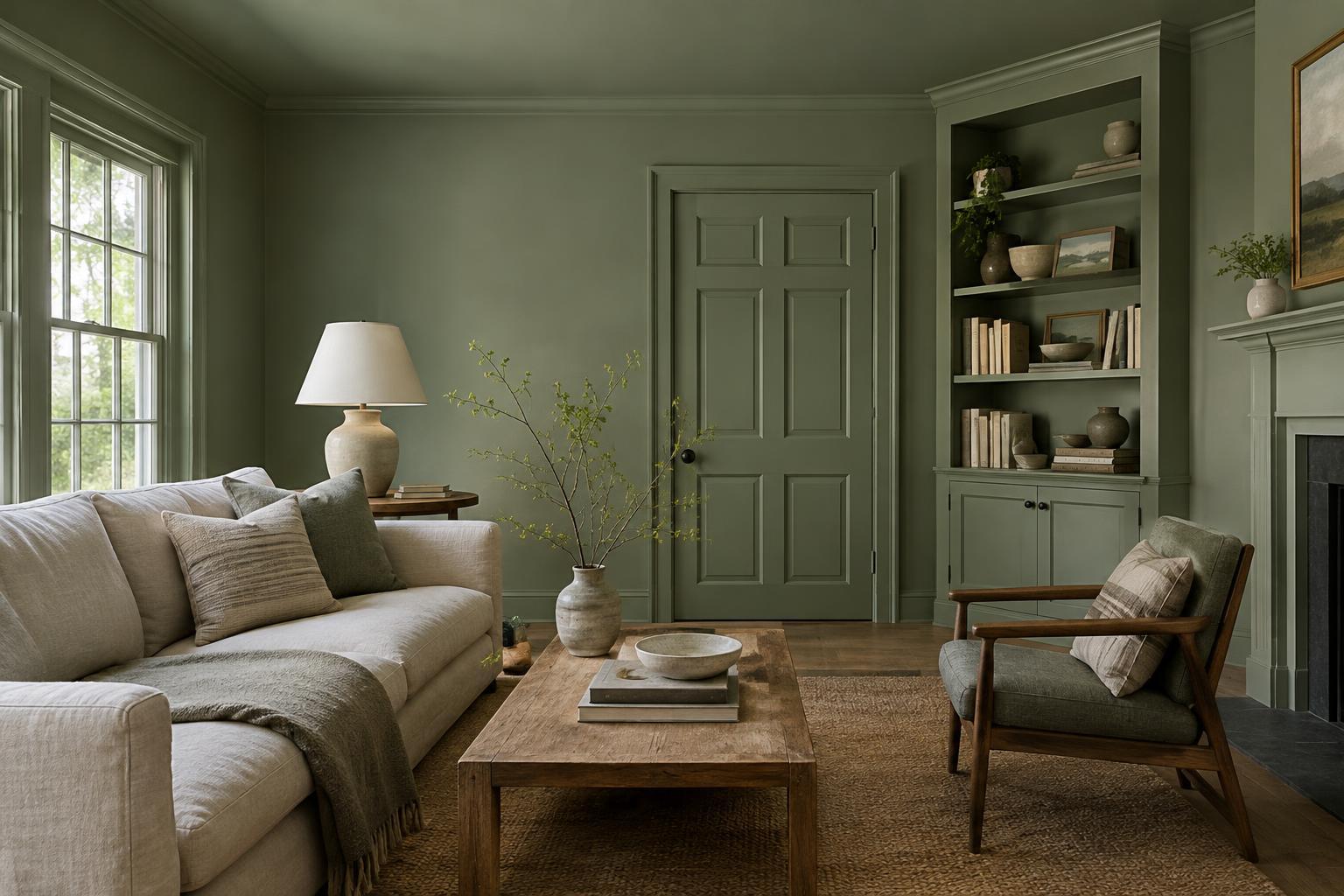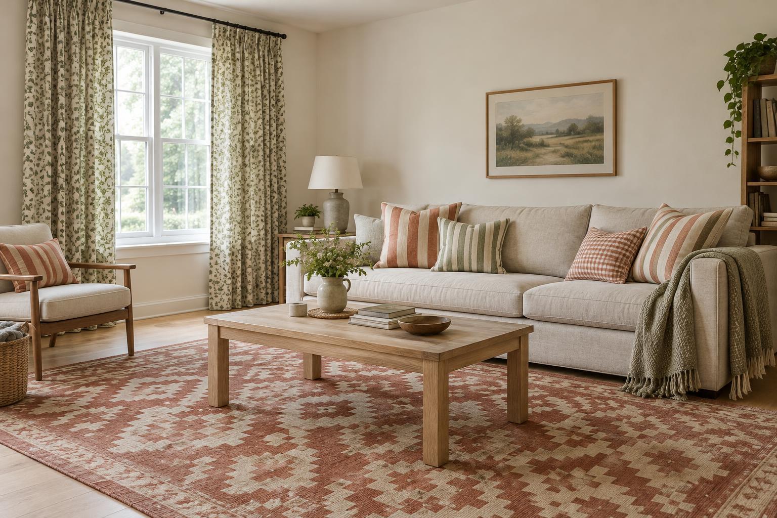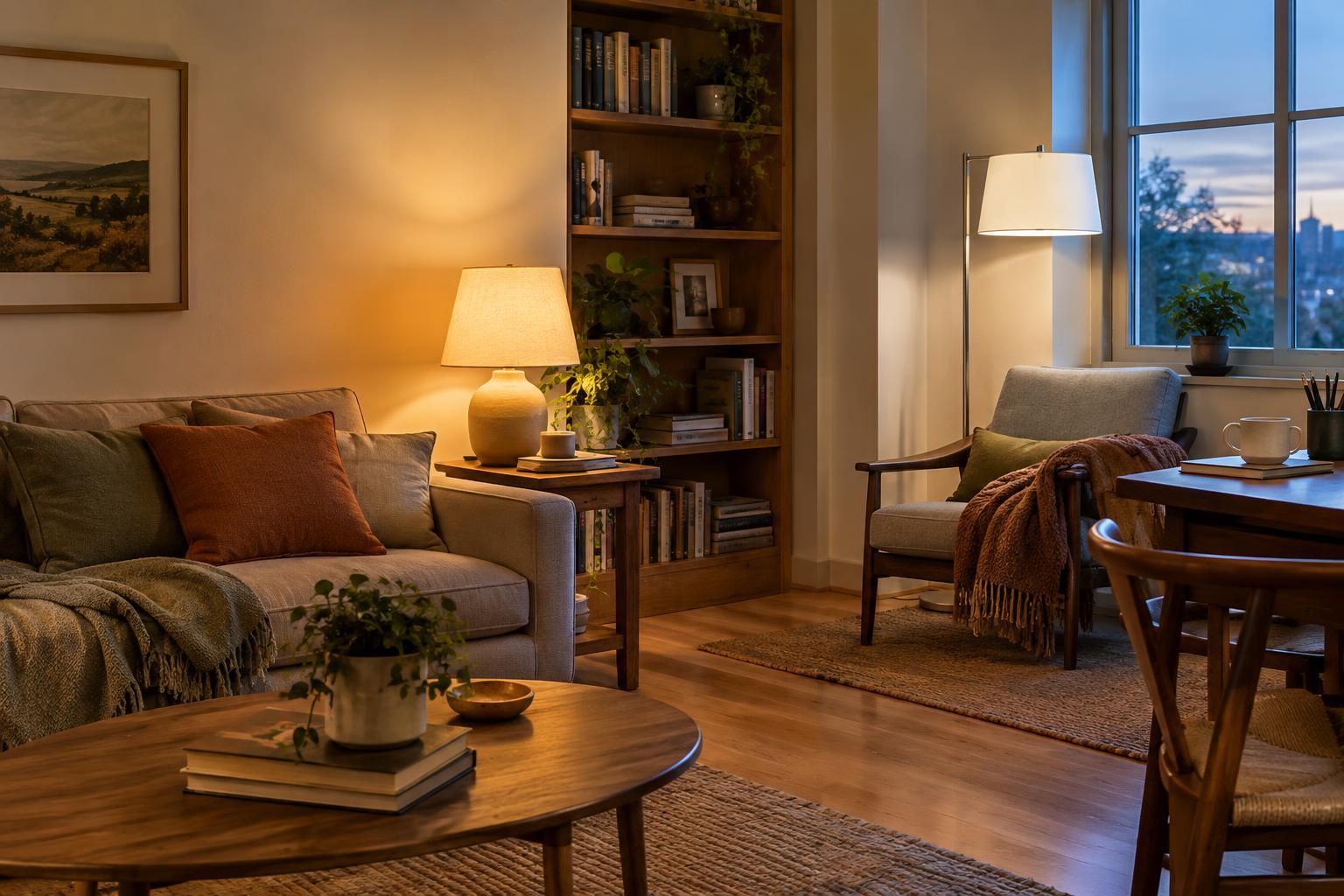
Start with the Kelvin label
Light bulb color temperature describes how warm or cool the light appears. It is printed on many bulb packages as a number followed by K, for Kelvin. Lower numbers look warmer and more golden; higher numbers look cooler and whiter. A bulb around 2700K typically gives the familiar soft glow associated with a traditional incandescent bulb. Around 3000K, light still looks warm but may feel a little clearer. Bulbs around 4000K look more neutral or cool, while higher numbers can have a distinctly daylight-like appearance.
There is no single correct number for a home. The useful question is what you want to do in the space and how you want it to feel. A warm bulb can make a reading corner inviting, while a clearer one may help you see ingredients on a kitchen counter. Remember that color temperature is not brightness: lumens describe how much light a bulb produces. If a room feels dim, changing to a cooler color alone may not solve the problem.
Choose for the way you use each room
For living rooms and bedrooms, 2700K is a dependable starting point if you prefer a relaxed atmosphere in the evening. Table lamps and wall lights in this range can soften a room without asking the ceiling fixture to do all the work. If 2700K seems too amber against your furnishings, try 3000K. It keeps some warmth while making pale walls, books, and textiles appear a bit less golden.
Kitchens, dining areas, and multipurpose rooms often benefit from a choice based on the task rather than the room name. You might like 3000K at the dining table and a similar or slightly cooler light over a worktop where you prepare food. In a space that serves as both a home office and a place to unwind, separate lamps can give you more flexibility than one overhead bulb. A focused desk light can be clearer without making the whole room feel like a workspace after hours.
Look at your colors and existing light
Bulb color changes how surfaces look. Warm light can emphasize cream, terracotta, wood, and other earthy finishes. Cooler light may make white surfaces seem crisper, but it can also leave a warm-toned room feeling less comfortable than you intended. Neither effect is a rule: paint finish, shade material, daylight, and the placement of the lamp all influence what you see.
Before replacing every bulb, test one in the fixture where it will be used. View the room both in daylight and after dark, when electric light matters most. Look at a wall, a sofa fabric, and a familiar object such as a book cover. If you are choosing several bulbs for an open-plan area, compare them while they are on together. Two nearby bulbs labeled with different color temperatures can create a distracting shift as you move through the space. Matching the main bulbs is an easy way to make the lighting feel more settled.
Check more than color temperature on the box
Once you have a preferred Kelvin range, check lumens to find an appropriate brightness for the fixture and purpose. A small bedside lamp and a central ceiling light need not produce the same amount of light, even if their color temperatures match. Also check the bulb’s fitting, physical size, and any limits marked on the fixture. If you use a dimmer, choose a bulb labeled as compatible with dimming and check that it works with your switch; not every bulb dims smoothly.
You may also see a color rendering index, or CRI, on the package. It describes how faithfully colors appear under a light compared with a reference light. A higher CRI can be useful where you want to judge clothing, food, or interior colors, although Kelvin and CRI describe different qualities. If a bulb offers adjustable color temperature, try its settings at the times you normally use the room rather than assuming the coolest option will be best for every task.
Build a comfortable mix
A pleasant room rarely depends on finding one perfect bulb. Try combining general light with smaller sources where they are useful: a floor lamp beside a chair, a lamp on a sideboard, or task lighting at a counter. This lets you use less overhead light when you want to relax and more directed light when you need to see clearly. Shades matter, too. An opaque shade directs light differently from a translucent one and can change how bright or gentle the same bulb feels.
For a simple first purchase, pick one room, choose a warm or slightly warm bulb that suits its main use, and live with it for a few evenings. Notice whether you need more light, a different position, or a different color. Making those decisions one fixture at a time is easier than trying to solve the whole home from the bulb aisle.