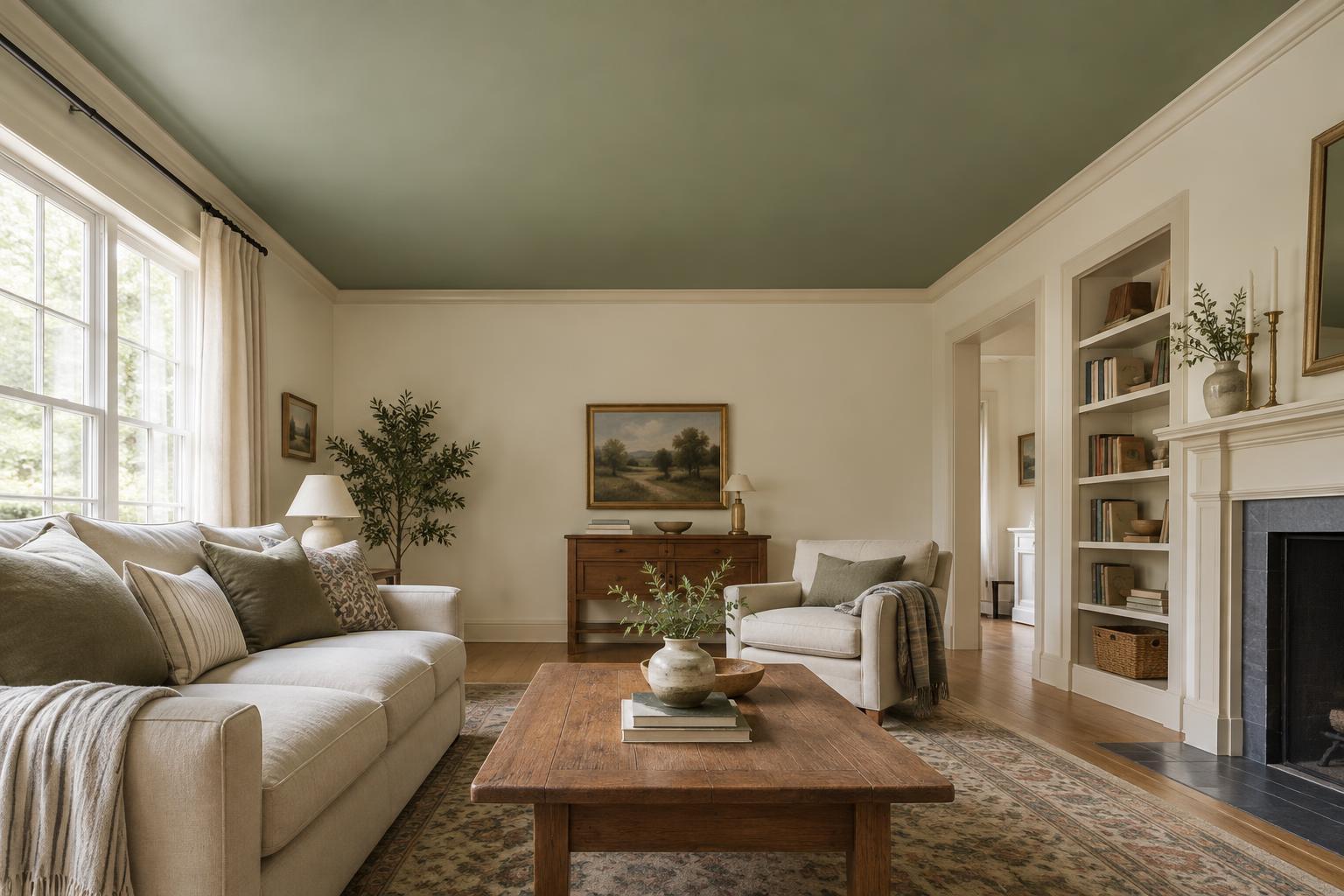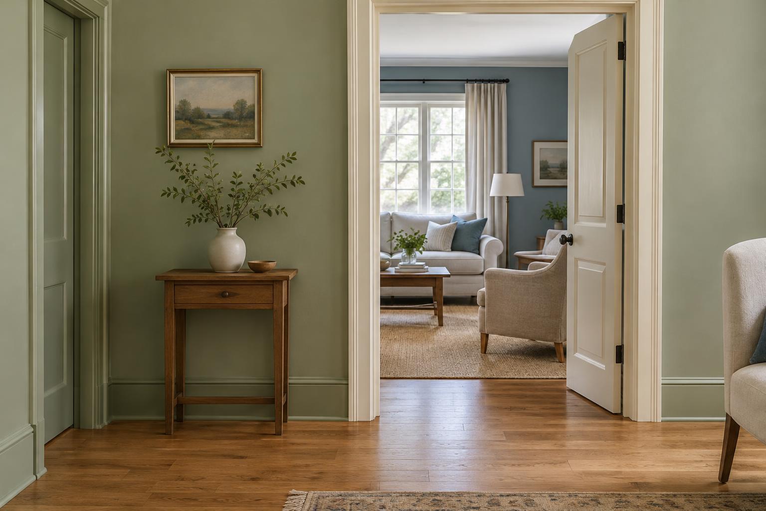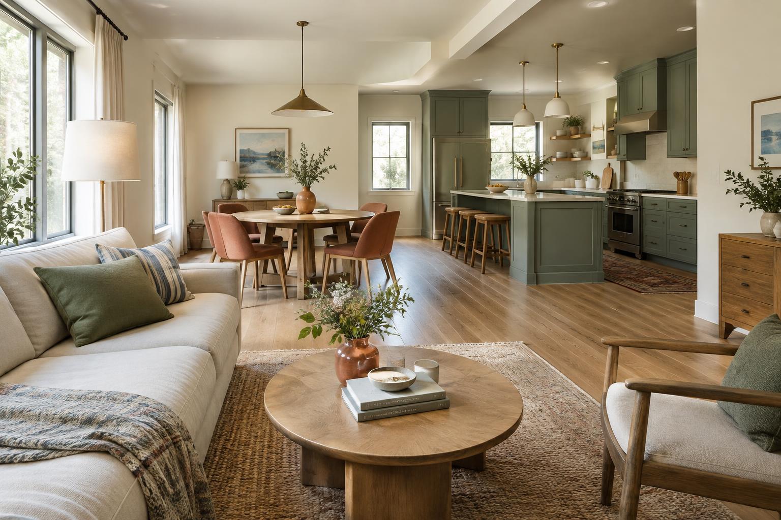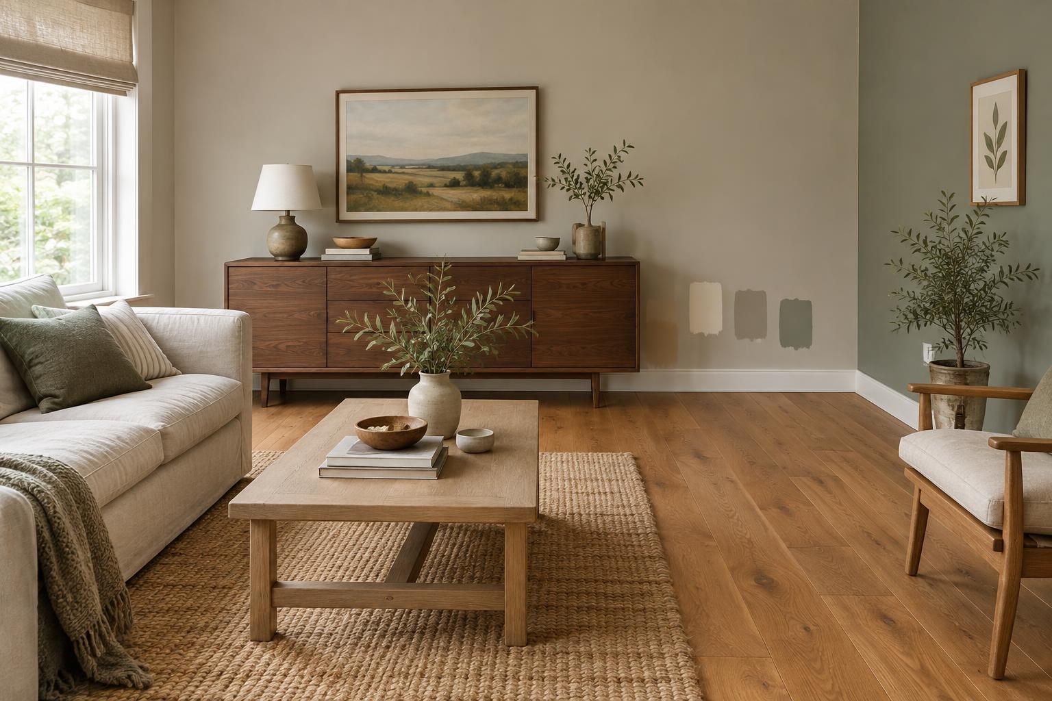
Start with the wood you cannot easily change
A room may contain several kinds of wood, but they do not all need an equal say in the paint decision. Start with the largest or most permanent surface, usually the floor. Notice whether it reads as pale or dark, and whether its overall impression is golden, reddish, grayish or fairly neutral. Then look at major furniture pieces. A dining table or a bank of cabinets will affect the room more than a small side table.
Look at the wood from across the room before studying individual boards or grain. Floors often vary in color, so one unusually orange or gray plank may not represent the whole surface. If the furniture has a different finish from the floor, that is not automatically a problem. The wall color can provide a calm background for both rather than trying to match either one exactly.
Use undertones as a guide, not a strict rule
Undertone describes the subtle color that comes through beneath a surface’s main color. Honey-colored oak may appear yellow or orange; walnut can lean warm brown; some stained woods look red, gray or nearly black. Wall paint has undertones too. A beige may lean pink, yellow or green, while a white might look creamy beside one floor and stark beside another.
One approach is to echo the wood’s warmth without copying its exact hue. Creamy off-white, soft beige or muted olive can sit comfortably beside golden wood. With reddish wood, a restrained green, blue-green or neutral with little pink can offer balance. Gray-toned wood may work with soft whites or muted colors, though an overly cool gray wall can make the whole room feel flat. These are starting points, not fixed pairings: your room’s light and other finishes matter just as much.
When a sample seems almost right but makes the wood look more orange, pink or gray than you want, try a neighboring shade with a different undertone. Small shifts can be more useful than jumping to an entirely new color family.
Decide how much contrast the room needs
Wall color can either blend with the wood or help define its shape. Pale floors against light walls create a quiet, open-looking backdrop, especially when there is texture in rugs, upholstery and curtains. Dark floors against light walls make the floor more noticeable. If you prefer a softer transition, a mid-tone wall color can reduce that sharp contrast.
The same choice applies to furniture. A dark wood bookcase stands out against a light wall; against a deep wall color, it becomes part of a more enveloping composition. Neither result is inherently better. Think about what you want to notice first when you enter the room. If a wooden table is the focal point, give it some separation from the wall behind it. If several wood finishes already compete for attention, a quieter wall color may help them feel connected.
You can also add contrast without using a bold wall color. A light rug breaks up a dark floor, while artwork or upholstery can bring color into a room with pale walls and pale wood.
Check the other fixed finishes
Wood is only part of the room. Stone counters, tile, brick, trim and large upholstered pieces can change how a paint color appears. A warm off-white that flatters oak flooring may look yellow beside a cooler white countertop. In an open-plan space, also consider what is visible beyond the room so the wall color does not create an abrupt change.
If the finishes pull in different directions, avoid trying to repeat every undertone on the walls. A muted neutral can give them breathing room. If you want color, choose a shade that relates to at least one substantial feature and let smaller accessories connect the rest. Wood tones can vary naturally within one room; they do not need to be perfectly matched to look intentional.
Test paint beside the floor and furniture
Paint chips are useful for narrowing choices, but a larger sample is easier to judge. Put sample paint on a movable board or test an appropriate patch of wall. View it vertically near the floor and beside important furniture, rather than judging it on a tabletop. Compare a few close options at the same time so differences in warmth and depth are easier to see.
Check the samples in morning light, later daylight and the lighting you normally use at night. A shade that feels gentle in bright light may look dull or much stronger after dark. If one color works only for a short part of the day, keep looking. Once you have a likely choice, consider how it meets the trim and ceiling, too. A little patience at this stage makes it easier to choose a wall color that works with the wood you live with, not just the color you imagined in the store.