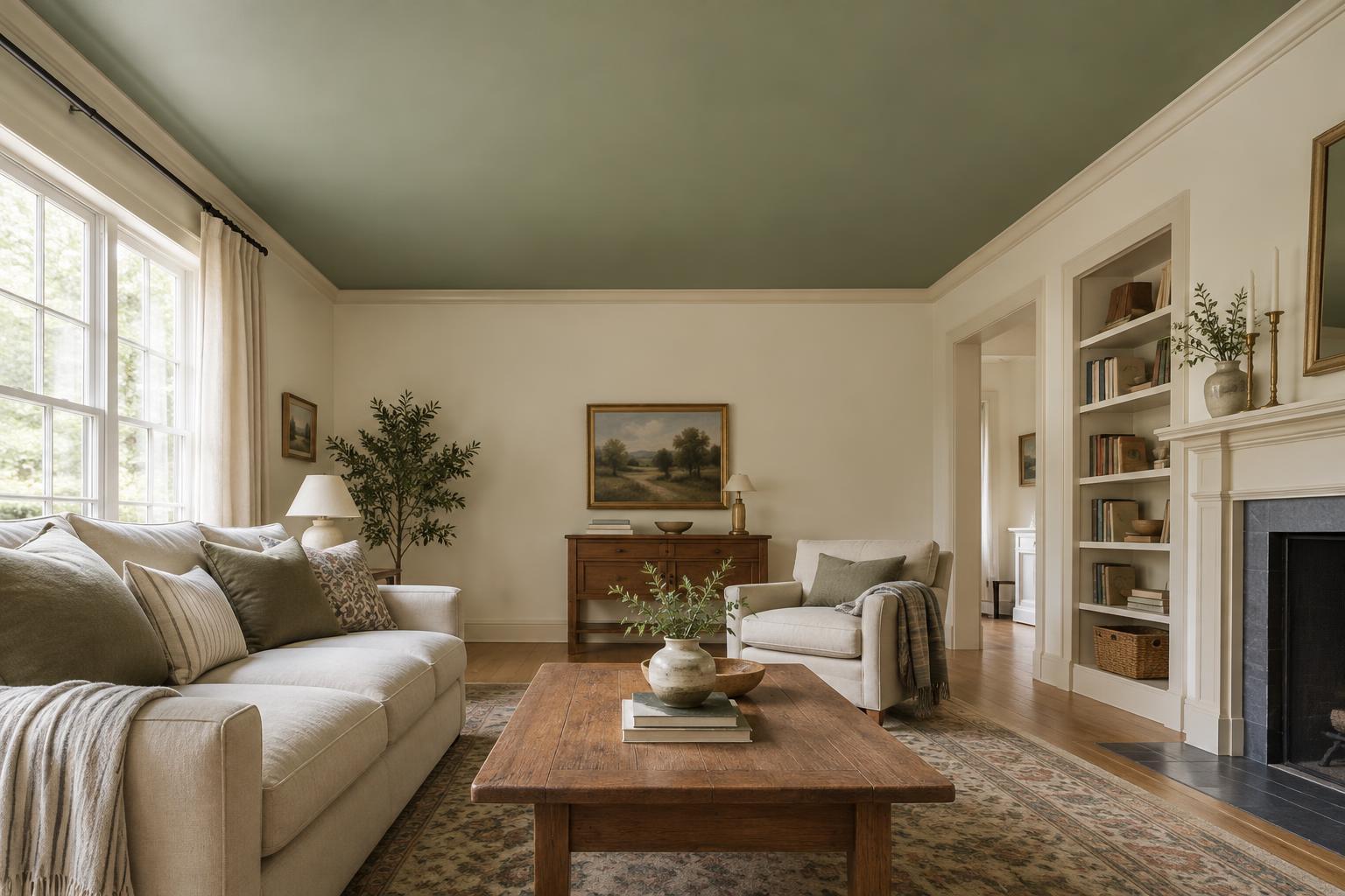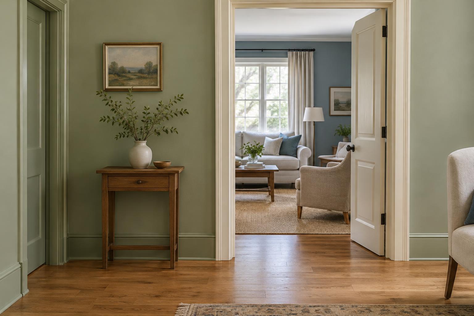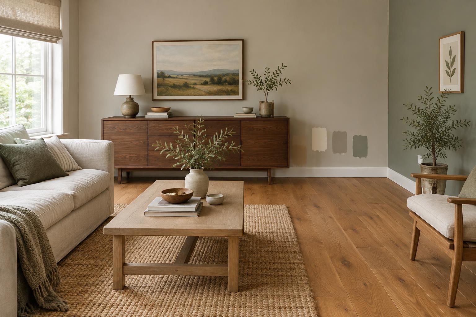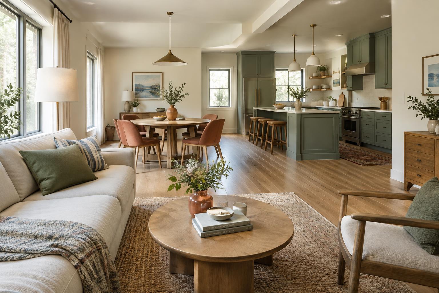
Start with what you can see at once
In an open-plan home, the kitchen, dining area, and living space may serve different purposes, but your eye often takes them in together. Before choosing paint, stand at the main entrances and at the places where you spend the most time. Notice which walls, cabinets, floors, and large pieces of furniture appear in the same view. These are the surfaces that need to work together most closely.
Make a short list of colors you cannot easily change: flooring, countertops, tile, a sofa, or a prominent rug. Then note whether those colors feel warm, cool, muted, or vivid. You do not have to match every undertone perfectly. The aim is to avoid introducing several strong colors that compete with the fixed finishes. If the room already contains a lot of visual variation, a quieter wall color can give everything room to breathe.
Build a small palette with room to vary
A useful starting point is one background color, one or two supporting colors, and a restrained accent. The background might cover most walls, while supporting colors appear on cabinetry, upholstery, or a feature wall. The accent can be carried by smaller objects that are easy to move. This structure creates a connection without making every zone look identical.
Choose colors that share a quality, such as similar softness or warmth, rather than insisting on exact matches. For example, a muted blue chair can sit comfortably near soft green dining chairs if both colors have a similarly subdued feel and the surrounding neutrals support them. If you prefer high contrast, repeat a dark tone in a few deliberate places instead of scattering unrelated dark objects throughout the space. Repetition gives the eye a path to follow.
Use repetition to link separate zones
A color does not need to cover a whole wall to connect two areas. The tone of a kitchen cabinet could return in a living-room cushion, a framed print, or a glazed vase. A warm wood finish on dining chairs might be echoed by a side table. These links are most effective when they are noticeable but not overly precise; a room feels collected rather than arranged as a matching set.
Pay particular attention to the boundaries between zones. A rug can establish the living area while borrowing a color from the dining area. A pendant light can mark the table without introducing a finish found nowhere else. If a long wall runs through multiple zones, keeping its main color consistent often makes the whole space feel calmer. You can then distinguish each activity area through furnishings, lighting, and smaller color shifts.
Give each area an identity without a hard break
Connection does not mean uniformity. A dining area may suit a deeper, more intimate color, while the kitchen benefits from a lighter-feeling backdrop. To make that change feel intentional, use a color from the same palette or repeat the deeper shade elsewhere in a smaller dose. Where a painted color ends, look for a natural stopping point such as a corner, alcove, doorway, or change in ceiling height. An abrupt change in the middle of an uninterrupted wall can be harder to resolve.
Consider the visual weight of each choice. Dark cabinets, a large patterned rug, and a saturated wall may all be appealing individually, but together they can crowd one sightline. Decide which element should lead, then let the others play a supporting role. This is especially helpful when furniture and kitchen finishes are both visible from the same seat.
Test colors across the whole space
Light can change noticeably from one end of an open-plan room to the other. A wall near a window may make a sample look different from the same color beside kitchen cabinets or under evening lamps. Place sample cards or painted boards in several locations and look at them at different times during an ordinary day. Check them next to fixed finishes as well as from across the room, where colors are more likely to be seen together.
Before buying more paint or accessories, take a final look at the space from its main viewpoints. Ask whether one color appears only once, whether a strong finish needs a quieter neighbor, and whether each zone still feels suited to its purpose. Adjusting a cushion, rug, or lamp is simpler than repainting an entire wall. A connected palette is not a rigid formula; it is a set of choices that makes moving through the home feel easy.