Start with the color beneath the color
Undertone is the subtle color you notice beneath a paint’s main impression. Two shades may both look beige at first, yet one leans yellow or peach while the other leans gray or green. That difference can become much easier to see once the paint covers a large wall. Warm undertones tend to suggest yellow, orange, red, or pink; cool undertones often suggest blue, green, or violet. These are useful descriptions, not strict categories. A color can sit close to neutral, and its appearance depends on what surrounds it.
The goal is not to decide that warm is better than cool. It is to notice what a color is doing before you commit to it. If you want a calm cream beside honey-colored wood, a faint yellow cast may feel comfortable. If you want a crisp white beside blue-gray tile, that same cream might look more yellow than you expected.
Compare similar samples, not isolated swatches
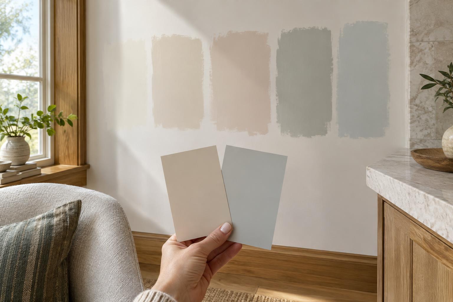
A single paint chip gives your eye very little to compare. Gather several shades of roughly the same depth and general color: a few off-whites, for example, rather than an off-white, a navy, and a terracotta. Place them side by side on a plain white sheet or a neutral surface. The differences often become clearer: one off-white looks pink next to another, while a third looks slightly green.
Look at the lighter and darker shades on the same paint strip, too. A midtone may reveal a hint of color that is hard to detect in its near-white neighbor. Then separate your favorites and view them on their own again. Side-by-side comparison helps you identify an undertone, but the strongest contrast is not necessarily the best guide to how the paint will feel in your room.
Use words that are specific enough to help you choose: creamy rather than warm, lavender-gray rather than cool. You do not need to name an undertone with certainty. Noticing that one sample is less pink than another may be all the information you need.
Let the fixed finishes have a say
Before choosing a wall color, look at the parts of the room you are not changing: flooring, countertops, tile, cabinetry, and large pieces of furniture. Hold samples near those surfaces rather than judging them only against an empty wall. A gray paint with a violet cast might be pleasing by itself but look unusually purple beside a greenish stone counter. A warmer gray could relate to the counter more comfortably, even if it was not your first choice on the sample card.
Matching every undertone is not required. Warm wood can look lovely with a cooler wall color, especially when the contrast is intentional and repeated elsewhere in the room. The useful question is whether the combination feels balanced to you. If a sample makes an existing finish look dingy, overly yellow, or unexpectedly pink, try a nearby shade with a different undertone before ruling out the whole color family.
Test paint where you will actually see it
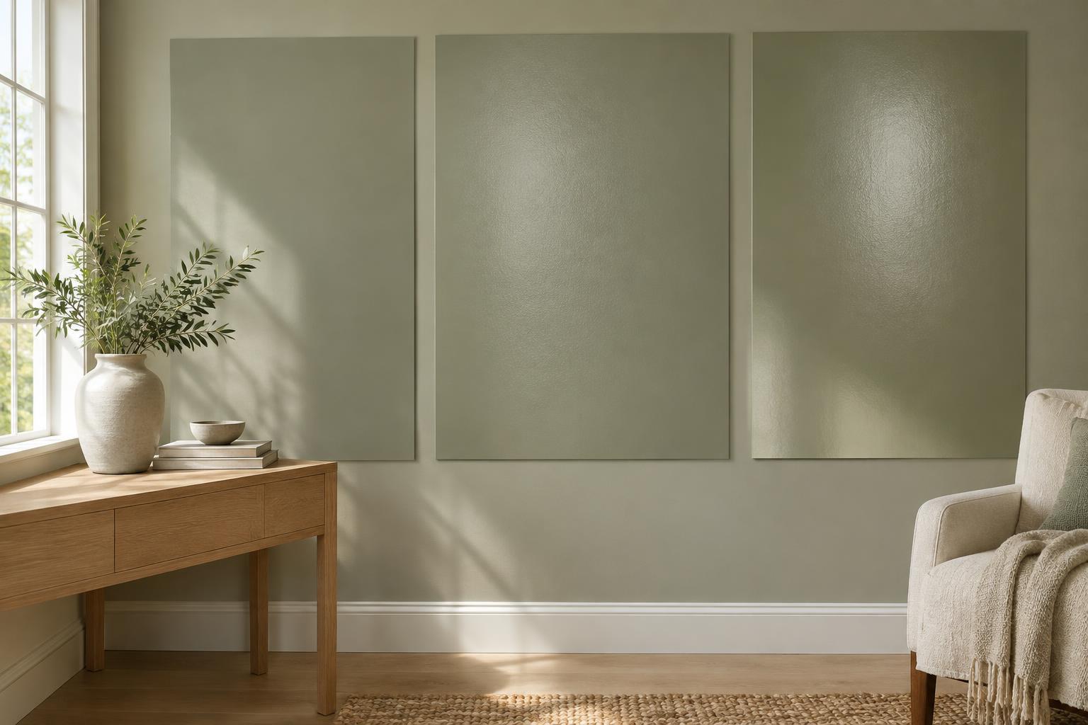
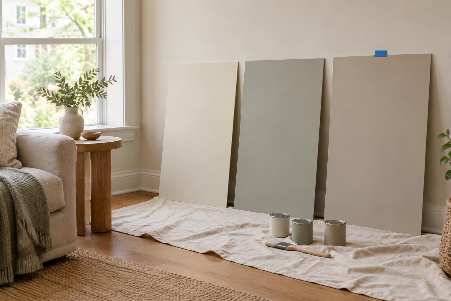
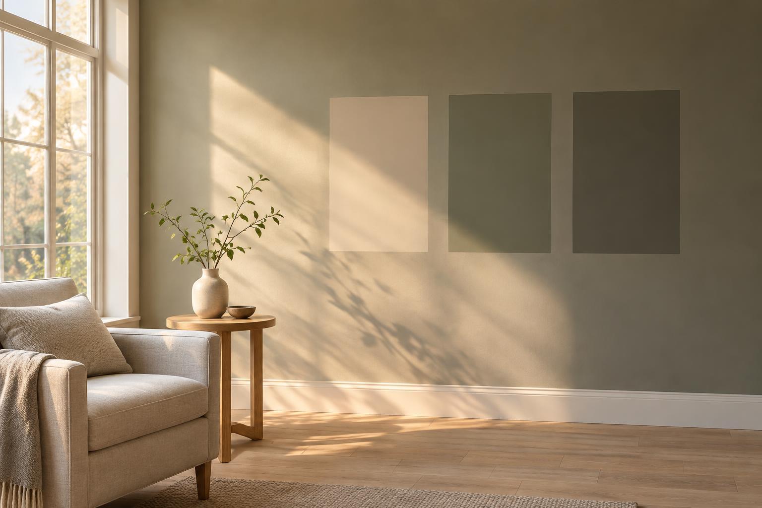
Light can change your impression of a color throughout the day. Daylight, lamps, and shadows may each emphasize a different part of a paint’s character. Test your shortlist in more than one spot, such as near a window and on a wall that stays shaded. If possible, paint sizable sample boards so you can move them around and view each candidate beside trim, flooring, and furnishings without covering the whole wall in patches.
Check the samples at the times you normally use the room. A color that seems ideal in bright afternoon light may feel too cool at breakfast or too peach under a favorite lamp. Also look at the sample from across the room. At that distance, you are responding to its overall effect rather than concentrating on tiny differences at the edge of a swatch.
Make the final choice easier
Narrow your options to two or three shades before buying larger samples. For each one, note what you like and what worries you: “soft beside the wood, but slightly green in the corner” is more useful than “maybe.” Keep the samples upright while judging wall colors, since laying them flat can put them in different light. If you are choosing both walls and trim, view those candidates together; even two colors sold as white can have noticeably different undertones.
Once you have found a color that works with the room’s fixed elements in the light you actually live with, stop hunting for a theoretically perfect undertone. Paint is part of a whole space, not a stand-alone swatch. The right choice is one that feels comfortable with your materials, lighting, and everyday routines.